Truly fine
Documentation.
Banner list section
Last update:
The banner list is a flexible section that gives you the ability to showcase arbitrary content (collections, products, offers) in multiple ways by selecting custom imagery and text.
Section settings
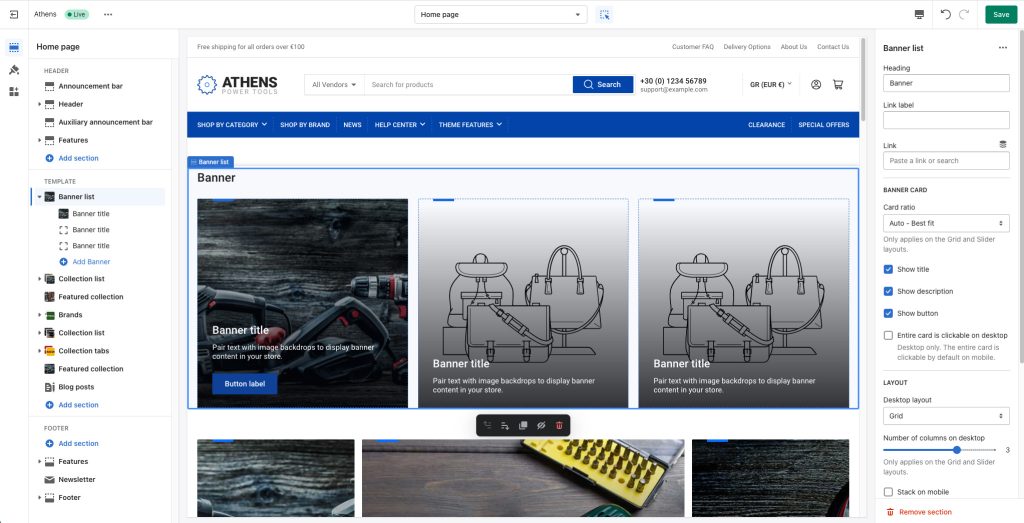
Heading: Set a title for this section. This is optional.
Link label + Link: With these settings you can create a button that will appear at the top right corner of your collection list section. For example if you have used this section to showcase a list of offers, you can add a button with a link to a collection or page called “Offers”.
Banner card
Card ratio: This option allows you to select the ratio of the banner card that will appear on the section. “Auto – Best fit” tries to fit the image in the card’s size (default option). “Adapt to first image” means that the ratio of all cards will be the inherent ratio of the first card’s image. Portrait and Landscape will force the images to be displayed as portraits or landscapes respectively. Only applies on the “Grid” and “Slider” layouts.
Show title: Toggles the visibility of the banner title.
Show description: Toggles the visibility of the banner description (if available).
Show button: Toggles the visibility of the banner button with its custom link.
Entire card is clickable on mobile: Select whether you wish the entire card to be clickable on desktop instead of just the title and/or button. Note that the entire card is always clickable on mobile regardless of this setting.
Layout
Desktop layout: With the “Grid” option you can create a typical grid layout of banners. A “Slider” option is also available that lets you create a simple slider layout. For this to work, the number of banners added in this section must be greater than the number of banners visible as set by the setting Number of columns on desktop. Lastly, a “Mosaic” option is available for masonry-like layouts. An example of this setting is available on the homepage of our demo website (check the “Popular categories” section).
Number of columns on desktop: Sets the number of columns (1,2,3 or 4). This option only applies on the “Grid” or “Slider” layouts.
Stack on mobile: By default, Athens will try to create a flexible scrollable horizontal list of banners on mobile. If you prefer to create a vertical list of banners though, simply enable this option.
Colors
Color scheme: Select one of the predefined color schemes as defined in Theme settings > Colors. For more information regarding the color schemes please refer to our article about creating your own color scheme.
Section spacing
The section spacing settings gives you the option to adjust the top & bottom section spacing values. Please note: If you select a color scheme with a background color, these settings will affect the spacing between the top or bottom of the section and the content of the section.
Banner block
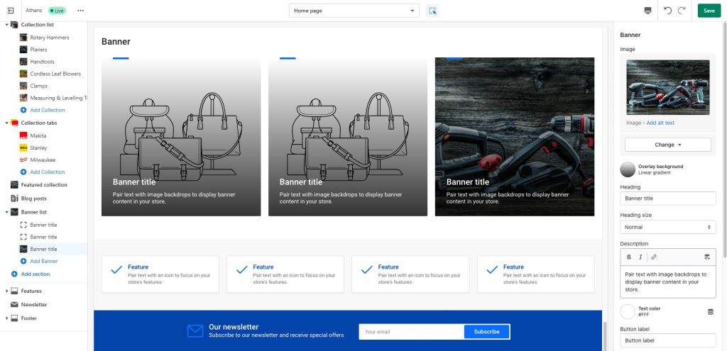
This section consists of “Banner” blocks representing each card in the banner section, with the following settings (all optional):
Image: Set an image for the particular banner. It will be displayed as the background image for the banner.
Overlay background: Optional gradient background to be used as an overlay (over the image and under the content).
Heading: The title of the banner.
Heading size: The size of the banner’s title.
Description: A short description of the banner.
Text color: The text color of the banner’s content (heading and subheading).
Button label + Link: The banner’s button text and where it should link to (page, collection, product, external link etc). Please note: Leaving the Button label empty but and the Link filled will link the entire banner to the selected URL.
Display button as text link: Optionally make the button be a textual link. Applies when the button is visible and when it is also not a textual link.
Button color scheme: Choose the color of the button. Applies when the button is visible and when it is also not a textual link.
Content position: Position the content (heading, subheading, button) anywhere you want on the banner.
Mobile layout – Image: Optionally set a different image for mobile layouts.
Mobile layout – Heading size: The banner’s title size in mobile devices.
Mobile layout – Content position: The banner’s content position in mobile devices.
Can't find what you are looking for? Feel free to submit a request.