Truly fine
Documentation.
Featured product section
Last update:
The featured product section is a section that gives you the ability to showcase a single product from your shop.
Section settings
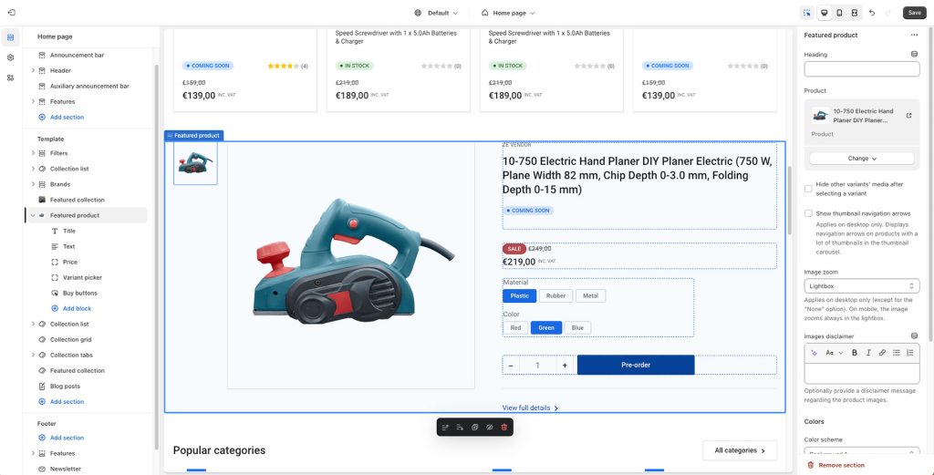
Heading: Set a title for this section. This is optional.
Subheading: Set a subtitle for this section. This is also optional.
Product: Set the product you want featured.
Hide other variants’ media after selecting a variant: If your product contains variants and particular images for each variant, enabling this option will only show the images for the selected variant.
Show thumbnail navigation arrows: Display navigation arrows for the thumbnail carousel on products with a lot of thumbnails (applies on desktop only).
Image zoom: Choose between “Lightbox“, “Zoom on hover“, “Lightbox and Zoom on hover“, and “None“. Lightbox (the default option) will enlarge the product’s main image in its own frame. Zoom on hover will zoom the image in a dedicate preview box next to it while the customer is hovering over the product’s main image.”Lightbox and zoom on hover” enables the behavior of both at the same time. Finally, “None” will disable zooming on the product’s images in any way. Note that this setting applies only on desktop (with the exception of the “None” option that disables it everywhere). In mobile the image enlarging functionality is always the Lightbox.
Images disclaimer: Optionally provide a short text that will be displayed underneath the product images as a disclaimer.
Colors
Color scheme: Select one of the predefined color schemes as defined in Theme settings > Colors. For more information regarding the color schemes please refer to our article about creating your own color scheme.
Section spacing
The section spacing settings give you the option to adjust the top & bottom section spacing values. Please note: If you select a color scheme with a background color, these settings will affect the spacing between the top or bottom of the section and the content of the section.
Section blocks
For maximum customization you can adjust this section’s layout by configuring its blocks. Note that you can reorder blocks as you see fit.
Title: The title block by default will also display the vendor, stock status, SKU, and barcode. You can also set it to display the product’s rating (learn how to set up product ratings here), and you can choose to hide the rating if there are no reviews. Finally, you can choose to show custom badges if you’ve set them up.
Text: The text section by default is populated dynamically by the Product subtitle field, optionally displayed under the title. This field is a “dynamic source” field and can be configured to display other values (read more on dynamic sources here). The text section also comes with a Color Scheme setting that can be used to make product text sections stand out. You can add up to four combinations of icon and text in the same text block.
Price: The price block displays the price (as well as discounts, group pricing, and other pricing info) and has no customization settings.
Variant picker: If the selected product contains variants, they will be shown on this block. You can choose from two different layouts for their display (buttons or dropdowns). You can also opt to hide the variant picker if only one variant exists across any combination of product options (size, color, etc).
Buy buttons: The buy buttons group displays a quantity input, the add to cart button and dynamic checkout buttons, like the buy it now button. You can turn off any one of them if you don’t need them. Via this block you can also enable the recipient form for gift cards where your customer can send a gift card to another person automatically after purchase (only applies on gift card products). More information about selling gift cards can be found on Shopify’s official guide.
Extra / social sharing: This block will display arbitrary text that you can adjust as well as social sharing icons, with the option to hide them (Facebook, Twitter, LinkedIn).
Request product information: This block is a customer engagement tool for the product that provides an easily accessible contact form. This allows customers to request more information about a specific product directly from the section, facilitating customer service and potentially increasing conversions.
Liquid: If you are a bit code savvy the liquid section allows you to add templating on your product using Shopify’s Liquid templating language. This block can only appear on the product information area (right-hand side), along with the title, price, etc.
Can't find what you are looking for? Feel free to submit a request.