Truly fine
Documentation.
Features section
Last update:
The features section is a section that gives you the ability to showcase a number of different shop features, offers, or general announcements and text you might want to display.
Section settings
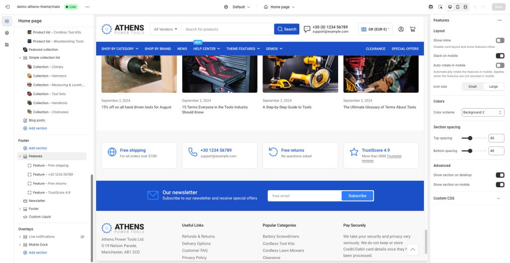
Layout
Show inline: The inline layout will discard the card appearance on the features and display them inline for more compact usage. Typical use-case is when you need just an icon and a title, or title only.
Stack on mobile: This option, when left enabled, will force the feature cards to stack one after the other in a single column on mobile devices. If disabled the features will be laid out in a scroller.
Auto-rotate in mobile: When enabled, the features slider will auto-rotate in mobile (requires that the “Stack on mobile” setting is turned off).
Icon size: Set a size for the icons, small or large.
Colors
Color scheme: Select one of the predefined color schemes as defined in Theme settings > Colors. For more information regarding the color schemes please refer to our article about creating your own color scheme.
Section spacing
The section spacing settings gives you the option to adjust the top & bottom section spacing values. Please note: If you select a color scheme with a background color, these settings will affect the spacing between the top or bottom of the section and the content of the section.
Visibility
Show section on desktop: Enable or disable the section’s visibility on desktop devices.
Show section on mobile: Enable or disable the section’s visibility on mobile devices.
Hide section if…: Enable this option when the section’s fields are bound to dynamic sources (i.e. metafields or metaobjects). The section will be hidden on the front-end if the most important field(s) are empty, i.e. when there is no meaningful output.
Feature block

Icon: Set an icon for the feature box (optional). For example, if you want to create a support card, typically you would want to choose the “Phone” icon.
Image: If an icon is not desired you can optionally upload your own image for the feature box. Recommended size for best viewing is 80×80.
Heading: The title of the feature box. In the previous example of the support card it could be your phone number or an email.
Text: A brief description of the feature.
Can't find what you are looking for? Feel free to submit a request.