Truly fine
Documentation.
Product page
Last update:
This template provides the default layout for each one of your store’s products. It is applied automatically to any new product created under Products from your Shopify Admin.
Template contents
The product template consists of two main sections and one optional:
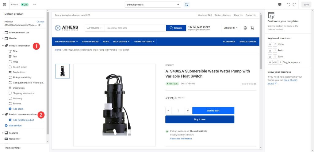
1. Product information
The product information section pulls all the information provided during product creation and uses them to create the product’s layout.
Settings
Hide other variants’ media after selecting a variant: If enabled, this setting will hide the media of other variants when selecting a particular variation. Enable this if you want to only show the selected variation’s image on the product media gallery, instead of all product images for all variants.
Show thumbnail navigation arrows: If enabled, this setting will display navigation arrows under the product image thumbnails. This provides a useful navigational aid for when you have a lot of thumbnails on a product.
Image zoom: Choose between “Lightbox“, “Zoom on hover“, “Lightbox and Zoom on hover“, and “None“. Lightbox (the default option) will enlarge the product’s main image in its own frame. Zoom on hover will zoom the image in a dedicate preview box next to it while the customer is hovering over the product’s main image.”Lightbox and zoom on hover” enables the behavior of both at the same time. Finally, “None” will disable zooming on the product’s images in any way. Note that this setting applies only on desktop (with the exception of the “None” option that disables it everywhere). In mobile the image enlarging functionality is always the Lightbox.
Images disclaimer: Optionally provide a short text that will be displayed underneath the product images as a disclaimer.
Blocks
Title: The title block by default will also display the vendor, stock status, SKU, and barcode. You can also set it to display the product’s rating (learn how to set up product ratings here), and you can choose to hide the rating if there are no reviews. Finally, you can choose to show custom badges if you’ve set them up.
Text: The text section by default is populated dynamically by the Product subtitle field, optionally displayed under the title. This field is a “dynamic source” field and can be configured to display other values (read more on dynamic sources here). The text section also comes with a Color Scheme setting that can be used to make product text sections stand out. You can add up to four combinations of icon and text in the same text block.
Price: The price block displays the price (as well as discounts, group pricing, and other pricing info) and has no customization settings.
Variant picker: If the product has any variations, buttons will appear for the user to select the variation they prefer. A drop down variation selector is available as well. The variant picker block also allows you to hide the variation picker when your product has just one product available (via the “Hide single variant” toggle) and also allow you to decide what to do with out of stock variants: Show, hide, or disable them (via the “Out of stock variants” setting).
Buy buttons: The buy buttons group displays a quantity input, the add to cart button and dynamic checkout buttons, like the buy it now button. You can turn off any one of them if you don’t need them. Via this block you can also enable the recipient form for gift cards where your customer can send a gift card to another person automatically after purchase (only applies on gift card products). More information about selling gift cards can be found on Shopify’s official guide.
Pickup availability: This block displays pickup availability information and does not offer any customization options.
Extra / Social sharing: This block allows you to show a small bit of text to encourage communication and social sharing, it also allows you to toggle Facebook, Twitter and LinkedIn sharing buttons.
Complementary products: Use this block to display hand-picked complementary products on the right of the product page (product information area), selected via the Shopify Search & Discovery app.
Description: This block displays the product’s description. It offers a customizable heading, an icon, and it can optionally be expanded by default. Tip: If you wish to hide the icon, simply select the empty option from the icon’s dropdown.
Expandable: This block creates an expandable area on the left of the product page, similar to the Description block. You may set a title, an icon, and the content to display, and you can optionally set this block to be expanded by default.
Request product information: This block is a customer engagement tool for the product that provides an easily accessible contact form. This allows customers to request more information about a specific product directly from the product page, facilitating customer service and potentially increasing conversions.
Liquid: If you are a bit code savvy, the liquid section allows you to add templating on your product using Shopify’s Liquid templating language. This block also offers a Position setting which will dictate whether it will be rendered on the left of the product page (the expandable boxes) or the right (in the product’s information area). When it’s positioned on the left, the block can become expandable as long as there is a title or an icon set. It can optionally be expanded by default. The block is hidden when there is no output from the Liquid setting.
2. Product recommendations
The product recommendations section will display products based on Shopify’s product recommendation engine, generally taking into account purchase history, product descriptions and related collections. You can easily customize the section heading and the number of products shown. The product card is configured to show the vendor and stock status. Additionally it can display the product rating as well.
You can select the related products of each product by hand, via the Shopify Search & Discovery app.
3. Custom related products
If you want to display a static list of hand picked products, you can do so by clicking the Add Related product button and selecting a product. Repeat until you set all the products you wish to display. Read how to Add custom product recommendations for more information, and instructions on how to show related products based on metafields.
Note: The functionality of this section was previously included in the Product recommendations section. Since version 1.4.0 of Athens, and due to Shopify’s guidelines on Shopify Search & Discovery app compatibility, the functionality was moved to the Custom related products section.
Can't find what you are looking for? Feel free to submit a request.