Truly fine
Documentation.
Collection lists section
Last update:
This section was introduced in version 6.3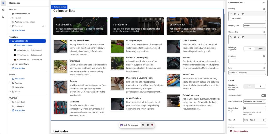
The Collection Lists section allows you to display groups of collections in a visually appealing list format on your Shopify store along with a utility introductory banner. Similarly to Product lists, this section offers customizable layout options, giving you control over how your collections are presented.
Section settings
Heading: Set a title for this section. This is optional.
Heading size: Adjust the size of your heading to make your message stand out. Available options: Small, Normal, Large, Extra large, and Extra extra large.
Subheading: Set a subtitle for this section. Also optional.
Headings alignment: Align the heading and subheading Left or Center.
Link label + Link: With these settings you can create a button that will appear at the top right corner of the section. For example if you have used this section to showcase a list of offers, you can add a button with a link to a collection or page called “Offers”. When Headings alignment is set to Center, the button appears at the bottom of the section.
Layout
Number of columns on desktop: Sets the number of columns (2 or 3).
Stack on mobile: By default, Athens will try to create a flexible scrollable horizontal list of product lists on mobile. If you prefer to create a vertical list, simply enable this option.
Description type: Control the source of the collections’ descriptions. Available options are:
- No description – Disables the description completely.
- Collection description – Displays the collections’ descriptions.
- Metafield description – Displays a short metafield-based description. This is useful if your normal collection descriptions are generally long, and you need to display short ones for a more aesthetically pleasing layout. The metafield must have the namespace and key
custom.short_descriptionand should be of the Single line text type (one value).
Description length: Truncates the description to a specific number of words. Set to 0 to disable.
Card ratio: This option allows you to select the ratio of the banner cards that will appear on top of the products. “Auto – Best fit” tries to fit the images in the card’s size (default option). “Adapt to first image” means that the ratio of all cards will be the inherent ratio of the first card’s image. Square, Portrait and Landscape will force the images to be displayed as such.
Colors
Color scheme: Select one of the predefined color schemes as defined in Theme settings > Colors. For more information regarding the color schemes please refer to our article about creating your own color scheme.
Section spacing
The section spacing settings gives you the option to adjust the top & bottom section spacing values. Please note: If you select a color scheme with a background color, these settings will affect the spacing between the top or bottom of the section and the content of the section.
SEO
Heading tag: Select the appropriate heading level (H1, H2, or H3) based on how you want the section title to appear.
Visibility
Show section on desktop: Enable or disable the section’s visibility on desktop devices.
Show section on mobile: Enable or disable the section’s visibility on mobile devices.
Hide section if…: Enable this option when the section’s fields are bound to dynamic sources (i.e. metafields or metaobjects). The section will be hidden on the front-end if the most important field(s) are empty, i.e. when there is no meaningful output.
Collections list block
The section consists of “Collections list” blocks representing each column in the section, with the following settings:
Background image: Upload a background image for the block. This image will serve as the backdrop for the block’s content.
Overlay background: Optional linear gradient overlay that appears over the background image to enhance text readability.
Heading: Enter the main title for the block, which will typically describe the list of products being displayed.
Description: Add supporting text to further describe the block’s content or provide promotional messaging for the products. Rich text options are available, including bold, italic, and lists.
Link: Add a URL (collection, product page, or external link) to direct users to a specific location when interacting with this block.
Collections: Manually select individual collections to feature in the list by searching in your store.
Can't find what you are looking for? Feel free to submit a request.