Truly fine
Documentation.
Flexi – Banner mosaic section
Last update:
This feature was introduced in version 6.5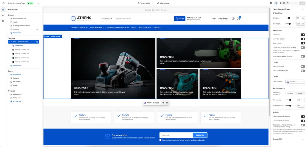
The Banner mosaic section is a highly flexible section (“flexi”) for displaying banners, and allows you to configure it using reusable theme blocks. Banners are laid on a grid, and each banner can take up a configurable amount of rows and columns, allowing you to create unique layouts.
Section settings
Grid settings
Grid gap: Controls the space (gap) between banners.
Minimum row height: Set the height of the grid’s rows.
Banner Card
Show title: Toggle to display the banner titles.
Show description: Toggle to display the banner descriptions.
Show button: Toggle to display the call-to-action buttons.
Entire card is clickable on desktop: When enabled, clicking anywhere on the card will follow the link provided.
Open links in a new window: When enabled, links will open in a new windows/tab.
Layout
Stack on mobile: Ensures banners are displayed one on top of the other on mobile devices for better visibility.
Make section fullwidth: When enabled, this option will turn the section into a fullwidth one.
Colors
Color scheme: Select one of the predefined color schemes as defined in Theme settings > Colors. For more information regarding the color schemes please refer to our article about creating your own color scheme.
Section spacing
The section spacing settings gives you the option to adjust the top & bottom section spacing values separately for desktop and mobile. Please note: If you select a color scheme with a background color, these settings will affect the spacing between the top or bottom of the section and the content of the section.
Visibility
Show section on desktop: Enable or disable the section’s visibility on desktop devices.
Show section on mobile: Enable or disable the section’s visibility on mobile devices.
Hide section if…: Enable this option when the section’s fields are bound to dynamic sources (i.e. metafields or metaobjects). The section will be hidden on the front-end if the most important field(s) are empty, i.e. when there is no meaningful output.
Banner block
Grid placement
Columns: The number of columns (1-4) this banner will occupy.
Rows: The number of rows (1-3) this banner will occupy.
Background and media
Image: Select the image to be displayed on the banner.
Self hosted video: Upload a custom mp4 for your video.
External video URL: YouTube or Vimeo URL. You can simply paste either the link from your browser’s bar or the URL that YouTube or Vimeo gives when attempting to share a video. Note that if both self-hosted and external URL are chosen, the self-hosted will take priority.
Overlay type: Select between a solid Color or a Gradient. The following Overlay background or Overlay color setting (depending on the overlay type you selected) allows you to customize the color or gradient. If you don’t want an overlay color at all, you can remove the respective color/gradient, or set its opacity to 0.
Content
Heading: The title of the banner.
Heading size: The size of the banner’s title.
Description: A short description of the banner.
Text color: The text color of the banner’s content (heading and subheading).
Button label + Link: The banner’s button text and where it should link to (page, collection, product, external link etc). Please note: If you leave the label empty but the link filled, the heading will still link to to the provided URL.
Display button as text link: Optionally make the button be a textual link. Applies when the button is visible and when it is also not a textual link.
Button color scheme: Choose the color of the button. Applies when the button is visible and when it is also not a textual link.
Content position: Position the content (heading, subheading, button) anywhere you want on the banner.
Mobile layout
Image: Optionally set a different image for mobile layouts.
Heading size: The banner’s title size in mobile devices.
Content position: The banner’s content position in mobile devices.
Can't find what you are looking for? Feel free to submit a request.