Truly fine
Documentation.
Seasonal banner section
Last update:
This feature was introduced in version 6.5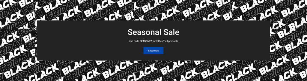
This section allows you to display a seasonal banner (optionally scheduled on specific dates), and even provided assets for popular seasonal events (e.g. Black Friday).
Section settings
Background
Background image: Select one of the provided background images, or select Custom image to use your own.
Custom image: Select an image to be used as the background. Applies only when Background image is set to Custom image.
Repeat background image: When enabled, the background image will be repeated to fill the background. Applies only when a Custom image is set. Works best with images that have a solid background color, or contain repeatable patterns that can be used as tiles.
Animate background: When enabled, animates the background image in diagonal direction. Requires that the Repeat background image setting is enabled.
Mobile background image: Optionally set a different background image for mobile devices. You can also individually control repeat and animation.
Content box
Content box color scheme: Select one of the predefined color schemes as defined in Theme settings > Colors. For more information regarding the color schemes please refer to our article about creating your own color scheme.
Layout
Make section fullwidth: When enabled, this option will turn the section into a fullwidth one.
Section height: Set the section height to be small, medium, or large.
Section spacing
The section spacing settings gives you the option to adjust the top & bottom section spacing values separately for desktop and mobile. Please note: If you select a color scheme with a background color, these settings will affect the spacing between the top or bottom of the section and the content of the section.
Visibility
Show section on desktop: Enable or disable the section’s visibility on desktop devices.
Show section on mobile: Enable or disable the section’s visibility on mobile devices.
Hide section if…: Enable this option when the section’s fields are bound to dynamic sources (i.e. metafields or metaobjects). The section will be hidden on the front-end if the most important field(s) are empty, i.e. when there is no meaningful output.
Countdown block
Start date: Choose the date at which you’d like the section to appear. The section will be completely hidden before this date. The date must strictly be in the format: YYYY-MM-DD. For example, for January 09, 2024 it would be: 2024-01-09.
Start time: Optionally set a start time in the format HH:MM in 24-hour format (e.g. 17:00). This field is optional, and if left empty the assumed time will be the midnight of the start date (i.e. the beginning of the that day). Also note that the time uses the store’s timezone.
End date: Choose the date at which you’d like the countdown to expire. The date must strictly be in the format: YYYY-MM-DD. For example, for January 09, 2024 it would be: 2024-01-09.
End time: Optionally set an end time in the format HH:MM in 24-hour format (e.g. 17:00). This field is optional, and if left empty the assumed time will be the midnight of the following day (i.e. the beginning of the next day). Also note that the time uses the store’s timezone.
Hide section when expired: When enabled, the whole section will be hidden when the end date (and optionally end time) has passed.
Heading block
Heading: Set the title of this block.
Heading size + Mobile heading size: Adjust the size of your heading (separately for desktop and mobile) to make your message stand out. Available options: Small, Normal, Large, Extra large, and Extra extra large.
Heading tag: Select the appropriate heading level (H1, H2, H3, or H4) based on how you want the section title to appear.
Text block
Text: Set the text of this block.
Text size: Adjust the size of your text to make your message stand out. Available options: Small, Normal, and Large.
Button block
Button label and Link: Customize the call to action button with a specific label and link it to any part of your store, such as a collection page, a contact form, or another desired location.
Display button as text link: Optionally display the button as a text link.
Open link in new window: When enabled, the link will open in a new windows/tab.
Enable coupon code: When enabled, the button will behave as a “copy coupon” button, which will copy the button’s label onto the user’s clipboard when clicked. The button’s link will be ignored.
Can't find what you are looking for? Feel free to submit a request.