Truly fine
Documentation.
Sliding panels section
Last update:
This section was introduced in version 6.3The Sliding panels section allows you to create stunning horizontal accordion-style layouts to feature your content in a compact form.
Section settings
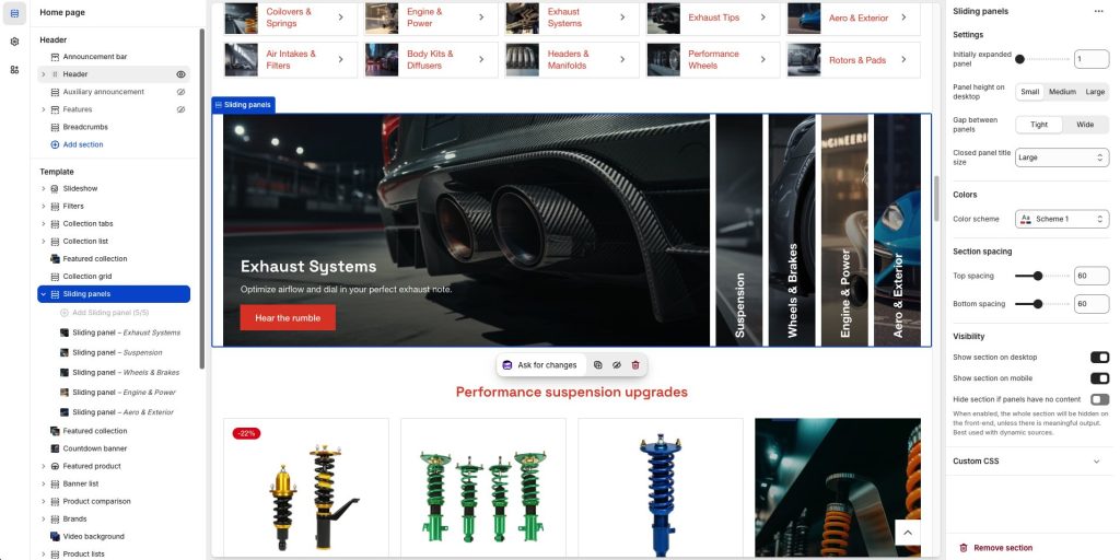
Initially expanded panel: Set the index of the panel/block that you want initially expanded. 1 will have the first block expanded, 2 the second, etc.
Panel height on desktop: Set the height of the panels. Only applies on desktop. Available options are Small, Medium, and Large.
Gap between panels: Controls the gap between panels. Available options are Tight and Wide.
Closed panel title size: Set the title size of the closed panels. Available options: Small, Normal, Large, Extra large, and Extra extra large.
Colors
Color scheme: Select one of the predefined color schemes as defined in Theme settings > Colors. For more information regarding the color schemes please refer to our article about creating your own color scheme.
Section spacing
The section spacing settings gives you the option to adjust the top & bottom section spacing values. Please note: If you select a color scheme with a background color, these settings will affect the spacing between the top or bottom of the section and the content of the section.
Visibility
Show section on desktop: Enable or disable the section’s visibility on desktop devices.
Show section on mobile: Enable or disable the section’s visibility on mobile devices.
Hide section if…: Enable this option when the section’s fields are bound to dynamic sources (i.e. metafields or metaobjects). The section will be hidden on the front-end if the most important field(s) are empty, i.e. when there is no meaningful output.
Sliding panel block
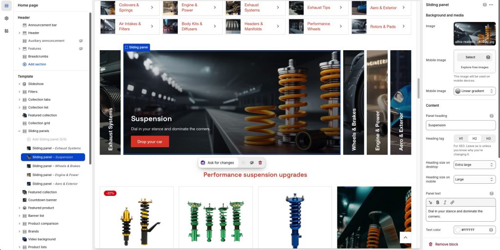
Image: Set a background image.
Mobile image: Optionally provide a different image to show on mobile.
Overlay background: Allows you to apply an overlay color or gradient over the background color/image.
Panel heading: The panel’s heading, visible both when the panel is expanded or collapsed.
Heading tag: Select the appropriate heading level (H1, H2, or H3) based on how you want the section title to appear.
Heading size on desktop + mobile: Adjust the size of your heading on desktop and mobile, to make your message stand out. Available options: Small, Normal, Large, Extra large, and Extra extra large.
Panel text: The panel’s content, visible only when the panel is expanded.
Text color: Set the text color of your heading and text.
Content position on desktop + mobile: Set the panel’s content position on desktop and mobile. Available options are all combinations of vertical (top, middle, bottom) and horizontal (left, center, right) positions.
Button label: Set the label of the button (optional). Leave the label empty to hide the button.
Button Link: Set the URL that the optional button will link to.
Button color scheme: Select one of the predefined color schemes.
Can't find what you are looking for? Feel free to submit a request.