Truly fine
Documentation.
Tabbed collection lists section
Last update:
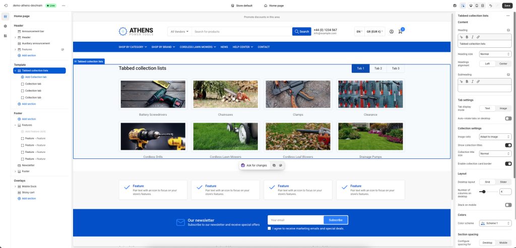
The Tabbed Collection Lists section is a flexible section that gives you the ability to showcase groups of different collections in a tabbed user interface.
Section settings
Heading: Set a title for this section (optional).
Heading size: Adjust the size of your heading to make your message stand out. Available options: Small, Normal, Large, Extra large, and Extra extra large.
Headings alignment: Align the heading and subheading Left or Center.
Subheading: Set a subtitle for this section. Also optional.
Tab settings
Tab display mode: Choose between text or image tabs.
Tab image width: Adjust the width of the tab. Only applies when Tab display mode is set to Image.
Auto-rotate tabs on desktop: When enabled, tabs will automatically rotate every few seconds.
Change tabs every: Set the number of seconds (3-9) after which the current tab will change. Applies only when Auto-rotate tabs on desktop is enabled.
Pause on hover: When enabled, tabs will not auto-rotate while the user hovers over the section.
Collection settings
Image ratio: This option allows you to select the ratio of the thumbnails that will appear on the cards. “Adapt to image” means that the ratio will be the inherent ratio of each image (the default option). Portrait, Square, Landscape, and Circle will force the images to be displayed as portrait, square, landscape or circle respectively.
Show collection titles: Whether to show the collections’ titles.
Collection title size: Adjust the size of the collection titles to make them more or less prominent. Available options: Small, Normal, Large, Extra large, and Extra extra large.
Enable collection card border: When enabled, collection images will be displayed with a border and padding applied.
Layout
Desktop layout: With the “Grid” option you can create a typical grid layout of products. The “Slider” option lets you create a simple slider layout. For the slider to work, the number of collections selected in each block must be greater than the number of collections visible as set by the following setting Number of columns on desktop.
Number of columns on desktop: Sets the number of columns (2 up to 12).
Stack on mobile: By default, Athens will try to create a flexible scrollable horizontal list of collections on mobile. If you prefer to create a vertical list, simply enable this option.
Colors
Color scheme: Select one of the predefined color schemes as defined in Theme settings > Colors. For more information regarding the color schemes please refer to our article about creating your own color scheme.
Section spacing
The section spacing settings give you the option to adjust the top & bottom section spacing values separately for desktop and mobile. Please note: If you select a color scheme with a background color, these settings will affect the spacing between the top or bottom of the section and the content of the section.
SEO
Heading tag: Select the appropriate heading level (H1, H2, or H3) based on how you want the section title to appear.
Visibility
Show section on desktop: Enable or disable the section’s visibility on desktop devices.
Show section on mobile: Enable or disable the section’s visibility on mobile devices.
Hide section if…: Enable this option when the section’s fields are bound to dynamic sources (i.e. metafields or metaobjects). The section will be hidden on the front-end if the most important field(s) are empty, i.e. when there is no meaningful output.
Collection List block
Tab label: The individual tab’s title.
Tab image: By default, the tab will show the select collection’s image (if any). You can choose a different one to override it. Applies only when Tab display mode is set to image.
Collections: Select the collections you wish to showcase in the tab.
Can't find what you are looking for? Feel free to submit a request.