Truly fine
Documentation.
Breadcrumbs section
Last update:
This feature was introduced in version 5.3.0While breadcrumbs were supported from the very first theme version, they have been quite rigid, as it was only possible to display them as the last element of the header. The new Breadcrumbs section solves this by allowing breadcrumbs to be placed anywhere on the header.
Prerequisites
First, make sure to disable the old, theme settings-based breadcrumbs by going to Theme settings > Layout, and make sure Enable breadcrumbs is unchecked. When both the section-based and theme settings-based breadcrumbs are enabled, a warning message will be displayed on the customization page.
Section settings
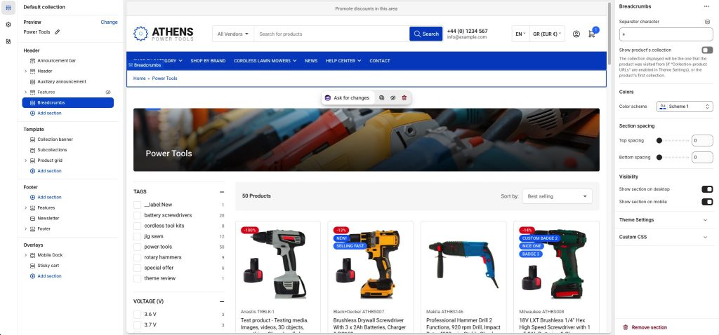
Separator character: Set one or more characters that will separate the breadcrumbs.
Show product’s collection: When enabled, breadcrumbs on product pages will include a collection, if available. The collection displayed is determined by:
- When Theme settings > Layout > Enable collection-product URLs is disabled, the product’s first collection is used. The collections’ order is not determined by the theme, so “first” means whichever collection Shopify returns first.
- When Theme settings > Layout > Enable collection-product URLs is enabled, and the customer ends up on a product page via a collection-based section (such as the product grid on a collection page, a Featured collection section, etc.), then that collection will be displayed. If the customer ends up on the products page via any other means that don’t have a collection context (e.g. search page, Featured product section, etc.) then the product’s first collection is used as above.
Please note that it’s not advised to enable the collection-product URLs functionality, due to possible SEO implications due to duplicate content. There’s nothing the theme can do to avoid such issues.
Colors
Color scheme: Select one of the predefined color schemes as defined in Theme settings > Colors. For more information regarding the color schemes please refer to our article about creating your own color scheme.
Section spacing
The section spacing settings gives you the option to adjust the top & bottom section spacing values. Please note: If you select a color scheme with a background color, these settings will affect the spacing between the top or bottom of the section and the content of the section.
Visibility
Show section on desktop: Enable or disable the section’s visibility on desktop devices.
Show section on mobile: Enable or disable the section’s visibility on mobile devices.
Can't find what you are looking for? Feel free to submit a request.