Truly fine
Documentation.
Collection grid section
Last update:
This section was introduced in version 1.9.1The “Collection grid” is a versatile section that presents your range of collections in a visually appealing, compact format. This tool allows you to handpick numerous collections and display them together, offering customers an easy way to explore the breadth of your product catalog.
Section settings
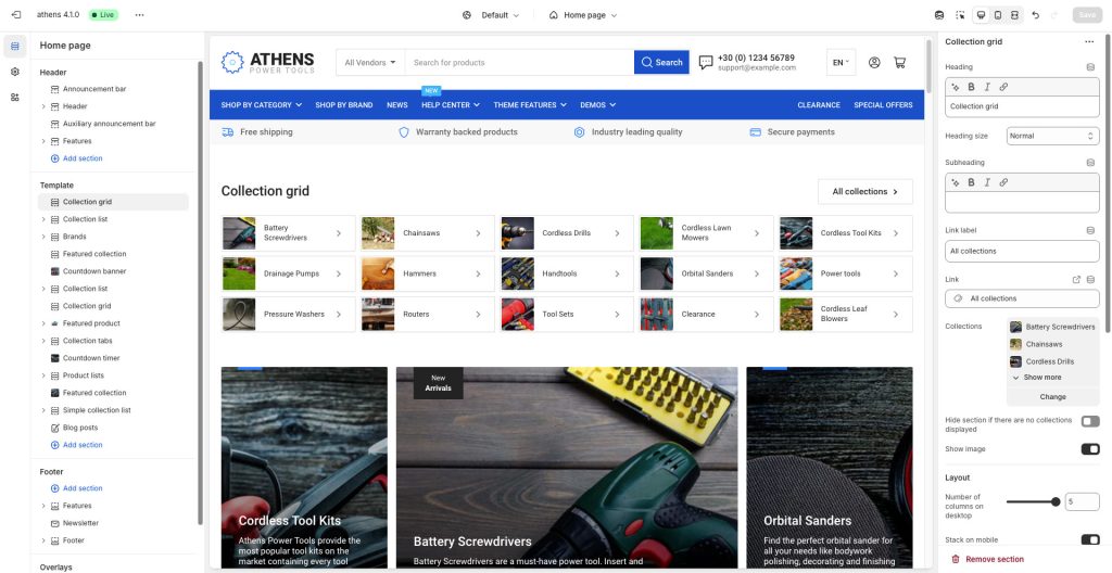
Heading: Set a title for this section. This is optional.
Heading size: Adjust the size of your heading to make your message stand out. Available options: Small, Normal, Large, Extra large, and Extra extra large.
Subheading: Set a subtitle for this section. Also optional.
Link label + Link: With these settings you can create a link that will appear at the top right corner of your collection grid section. For example if you have used this section to showcase a list of popular collections, you can add a link to your “All collections” page.
Collections: Select the collections you wish to showcase.
Hide section if there are no collections displayed: Enable this option to automatically hide the section when no collections are available to show.
Show image: Choose whether to show the collections’ featured image or not.
Layout
Number of columns on desktop: Sets the number of columns (1,2,3,4, or 5).
Stack on mobile: By default, Athens will try to create a flexible scrollable horizontal list of products on mobile. If you prefer to create a vertical list of products though, simply enable this option.
Number of columns on mobile: Select the number of columns that will be displayed on mobile (1 or 2), when Stack on mobile is enabled.
Colors
Content color scheme: Applies on the content cards. Select one of the predefined color schemes as defined in Theme settings > Colors. For more information regarding the color schemes please refer to our article about creating your own color scheme.
Color scheme: Applies on the rest of the section. Select one of the predefined color schemes as defined in Theme settings > Colors. For more information regarding the color schemes please refer to our article about creating your own color scheme.
Section spacing
The section spacing settings gives you the option to adjust the top & bottom section spacing values. Please note: If you select a color scheme with a background color, these settings will affect the spacing between the top or bottom of the section and the content of the section.
SEO
Heading tag: Select the appropriate heading level (H1, H2, or H3) based on how you want the section title to appear.
Visibility
Show section on desktop: Enable or disable the section’s visibility on desktop devices.
Show section on mobile: Enable or disable the section’s visibility on mobile devices.
Hide section if…: Enable this option when the section’s fields are bound to dynamic sources (i.e. metafields or metaobjects). The section will be hidden on the front-end if the most important field(s) are empty, i.e. when there is no meaningful output.
Can't find what you are looking for? Feel free to submit a request.