Truly fine
Documentation.
Contact form section
Last update:
This feature was introduced in version 6.2The Contact form section is a highly flexible section (“flexi”) that allows you to configure it using reusable theme blocks.
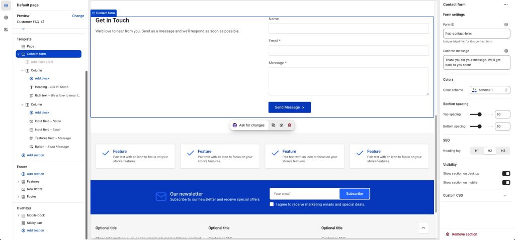
Section settings
Form ID: A unique identifier for this contact form. Must be unique in the page, so that form fields
Success message: The message displayed to the customer after they submit the form.
Colors
Content color scheme: Applies on the content cards. Select one of the predefined color schemes as defined in Theme settings > Colors. For more information regarding the color schemes please refer to our article about creating your own color scheme.
Color scheme: Select one of the predefined color schemes as defined in Theme settings > Colors. For more information regarding the color schemes please refer to our article about creating your own color scheme.
Section spacing
The section spacing settings gives you the option to adjust the top & bottom section spacing values. Please note: If you select a color scheme with a background color, these settings will affect the spacing between the top or bottom of the section and the content of the section.
SEO
Heading tag: Select the appropriate heading level (H1, H2, or H3) based on how you want the section title to appear.
Visibility
Show section on desktop: Enable or disable the section’s visibility on desktop devices.
Show section on mobile: Enable or disable the section’s visibility on mobile devices.
Column block
The column block is the only block that can be immediately assigned on the Contact form section. You can have up to two columns, allowing you to create one or two column layouts.
The Column block can contain zero or more blocks.
Content blocks
Form element blocks
Heading block
Heading text: The text of the heading.
Heading tag: Select the appropriate heading level (H1, H2, or H3) based on how you want the title to appear.
Heading size: Adjust the size of your heading to make your message stand out. Available options: Small, Normal, Large, Extra large, and Extra extra large.
Rich text block
Text content: The text content of the block.
Text size: Adjust the size of your text to make your message stand out. Available options: Small, Normal, and Large.
Media block
Image: Select the image to be displayed.
Self hosted video: Upload a custom mp4 for your video.
Video URL: A YouTube or Vimeo URL. You can simply paste either the link from your browser’s bar or the URL that YouTube or Vimeo gives when attempting to share a video. Note that if both self-hosted and external URL are chosen, the self-hosted will take priority. The image (if set) will be used as the video’s cover.
Alt text / Video description: Describe the image/video for screen readers. Leave blank to use the image’s built-in description.
Input field block
Field title: The title of the field. This will be visible as the field’s label, as well as on the submitted email. It must be unique among the rest of the fields in the section.
Input type: The type of the input field. Depending on the selected type and the customer’s browser, input will be validated for correctness against the selected type. E.g. if the type is URL, the browser will require that the user input begins with https://. The available options are: Text, Email, URL, and Phone.
Contact forms require at least one email field.Placeholder text: You may optionally provide a placeholder text for the field.
Required field: Enable this setting to make the field required.
Help text: You can optionally provide some additional text for the specific field, such as instructions, etc.
Field width: Allows you to set the field’s width to full or half. You can place two half-width field blocks one after the other, to create two-column layouts.
Textarea field block
Field title: The title of the field. This will be visible as the field’s label, as well as on the submitted email. It must be unique among the rest of the fields in the section.
Placeholder text: You may optionally provide a placeholder text for the field.
Number of rows: Adjust the number of rows of text that will be visible before a scrollbar appears. This affects the field’s height.
Required field: Enable this setting to make the field required.
Help text: You can optionally provide some additional text for the specific field, such as instructions, etc.
Hidden field block
Field title: The title of the field. This will be visible as the field’s label, as well as on the submitted email. It must be unique among the rest of the fields in the section.
Field value: The field’s value. This can either be a fixed value, or bound to a dynamic source (e.g. the product’s title, when placed in product templates).
Select field block
Field title: The title of the field. This will be visible as the field’s label, as well as on the submitted email. It must be unique among the rest of the fields in the section.
Options: The options available in the dropdown. Separate values with commas.
Placeholder text: You may optionally provide a placeholder text for the field.
Required field: Enable this setting to make the field required.
Help text: You can optionally provide some additional text for the specific field, such as instructions, etc.
Checkbox field block
Checkbox label: The title of the field. This will be visible as the field’s label, as well as on the submitted email. It must be unique among the rest of the fields in the section.
Checkbox value: Set the value that will be sent when the checkbox is checked. When the checkbox is not checked, no value will be sent.
Required field: Enable this setting to make the field required.
Help text: You can optionally provide some additional text for the specific field, such as instructions, etc.
Button block
Button text: The button’s text. Pressing the button submits the contact form.
Can't find what you are looking for? Feel free to submit a request.