Truly fine
Documentation.
Countdown timer section
Last update:
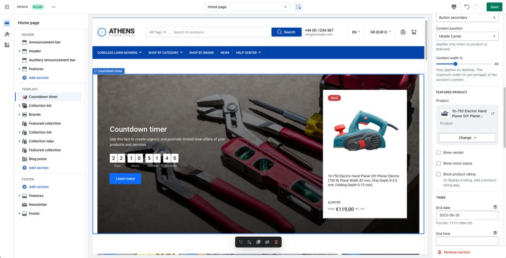
This section was introduced in version 1.9.1The “Countdown Timer” is a dynamic section that fosters urgency and boosts conversions. By showcasing a live countdown for a special event or offer’s end, paired with a customized call to action, it nudges customers to act quickly. The countdown, combined with your unique messaging, creates a compelling, time-sensitive shopping experience that drives sales.
Section settings

Make section fullwidth: Choose to extend the section to the full width of the viewer’s screen for a bold, immersive look.
Height (in pixels): Specify the height of the section in pixels to ensure it fits seamlessly into your store’s design. Note that this acts as a minimum height, which means that if your section’s content is taller than the specified height in this setting it will be ignored.
Background Image: Upload a background image to enhance the visual appeal of the section.
Overlay background: Add a gradient overlay to your background image to enhance readability and aesthetic appeal.
Heading and Description: Craft a compelling message with customizable heading and description fields. Use this space to clearly communicate what you’re offering and why visitors should take action.
Heading size: Adjust the size of your heading to make your message stand out.
Button label and Link: Customize the section’s call to action button with a specific label and link it to any part of your store, such as a product page, a contact form, or another desired location.
Button color scheme: Choose a color scheme for your button that complements your brand and draws attention.
Content position: Determine where your text, countdown timer, and button will be positioned within the section. Please note that this option applies only when no featured product is selected. When a product is selected the content is always laid out to the middle and left of the section.
Content width: Adjust the width of your content within the section to optimize readability and visual balance. Only applies on desktop. The maximum width (in percentage) of the section’s content (heading and description).
Featured product
The Countdown timer section also offers the ability to showcase a specific product.
Product: Select the product you wish to be showcased. Note that when a product is selected, the section’s layout becomes fixed with the content to the middle left and the product to the middle right of the section.
Show vendor: Show the product’s vendor on the product card.
Show stock status: Show the product’s stock status (in stock, out of stock, etc) on the product card.
Show product rating: Show the product’s rating on the product card.
Timer
The timer settings offer the ability to enable the live countdown timer in the section. Please note that this is completely optional and if there is no date set the section can act as a call to action section.
End date: Choose the date at which you’d like the countdown to expire. The date must strictly be in the format: YYYY-MM-DD. For example, for January 09, 2024 it would be: 2024-01-09.
End time: Optionally set an end time in the format HH:MM in 24-hour format (e.g. 17:00). This field is optional, and if left empty the assumed time will be the midnight of the following day (i.e. the beginning of the next day). Also note that the time uses the store’s timezone.
Hide the entire section when the expiration date has passed: Enable this if you want the section to be completely hidden from your customers once the date has expired and the countdown reaches zero.
Expiration message: Optionally add a message that will replace the countdown timer when the date has expired. Please note that this is incompatible with the above setting as if both are enabled the entire section would be hidden.
Mobile layout
Height: Adjust the height of the section for mobile devices.
Background image: Optional secondary image to be displayed only on smaller screen sizes.
Heading size: The section’s heading size in mobile devices.
Content position: Set the section’s content position for mobile devices.
Colors
Color scheme: Select one of the predefined color schemes as defined in Theme settings > Colors. For more information regarding the color schemes please refer to our article about creating your own color scheme.
Section spacing
The section spacing settings gives you the option to adjust the top & bottom section spacing values.
Can't find what you are looking for? Feel free to submit a request.