Truly fine
Documentation.
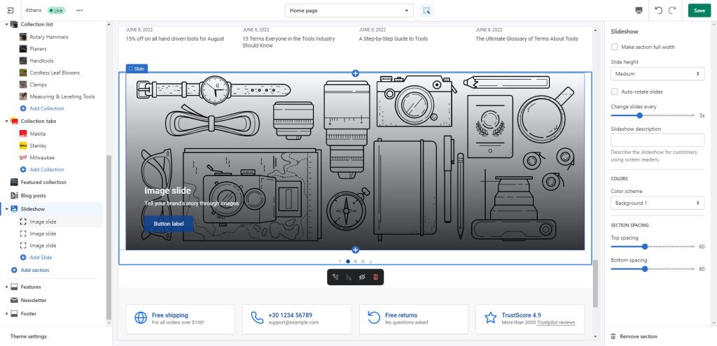
Slideshow section
Last update:
The slideshow section is a powerful section that gives you the ability to showcase any kind of content in a slideshow format.
Section settings

Make section fullwidth: Setting the section to fullwidth will make it span across the entire browser viewport.
Slide height: Controls the height of the slideshow. Using Adapt to first image will make the slideshow height equal to the height of the first image (regardless of other images’ heights). Small (320px), Medium (480px), and Large (560px), are predefined, fixed heights that the theme dictates. Finally, Full screen, Three quarters of screen, Two thirds of screen will set the height of the slideshow according to the height of the viewport. Note that in mobile the height is adjusted automatically for best appearance.
Auto-rotate slides: Turning this on will make the slideshow play automatically.
Change slides every: If Auto-rotate slides is turned on, this settings controls the speed at which slides will be alternating (in seconds).
Slideshow description: This field will add a description on the slideshow for screen readers. It is highly recommended you fill this in to improve your shop’s accessibility.
Colors
Color scheme: Select one of the predefined color schemes as defined in Theme settings > Colors. For more information regarding the color schemes please refer to our article about creating your own color scheme.
Section spacing
The section spacing settings gives you the option to adjust the top & bottom section spacing values. Please note: If you select a color scheme with a background color, these settings will affect the spacing between the top or bottom of the section and the content of the section.
Image slide block

This section consists of multiple “Image slide” blocks with the following settings:
- Image: The image of the slide.
- Overlay background: Optional gradient background to be used as an overlay (over the image and under the content).
- Heading: The title of the slide.
- Heading size: The size of the slide’s title.
- Subheading: A brief description or subtitle of the slide.
- Primary button label: Filling this in will display a button under the heading and subheading of the slide.
- Display primary button as text link: Optionally make the button appear as a textual link.
- Primary button color scheme: Choose the color of the primary button.
- Primary link: Set a link for your primary button (page, collection, product, external link, etc).
- Secondary button label: Filling this in will display a secondary button under the heading and subheading of the slide, next to the primary button.
- Display secondary button as text link: Optionally make the button appear as a textual link.
- Secondary button color scheme: Choose the color of the secondary button.
- Secondary link: Set a link for your secondary button (page, collection, product, external link, etc).
- Content position: Position the content (heading, subheading, button) anywhere you want on the slide.
- Content width percentage: Control the maximum allowed width (relative to the slide) that the slide’s content can span. Ignored on mobile.
- Mobile layout – Image: Optional secondary image to be displayed on smaller screen sizes only.
- Mobile layout – Heading size: The slide’s title size in mobile devices.
- Mobile layout – Content position: The slide’s content position in mobile devices.
Can't find what you are looking for? Feel free to submit a request.