Truly fine
Documentation.
Collections page
Last update:
This is the default Collections page template and it is how your Collections will display if you don’t apply another template to them.
Template contents
The template consists of the following sections:

Collection Banner
The section has both the Show collection description and Show collection image options checked. In order for all the necessary information to show up you will need to set a Title, a Description and a Collection image for each of your Collections. You can do that from the Collections menu under Products in your Shopify Admin.
By default the collection’s description on the banner will have a fixed with for best appearance, but if you find to have longer collection descriptions that need more space, keep in mind you can always enable the “Make description fullwidth” option.
Finally, the “Gradient overlay opacity” setting controls the opacity of the black gradient that overlays the banner’s image.
Adding a countdown timer to collection banners
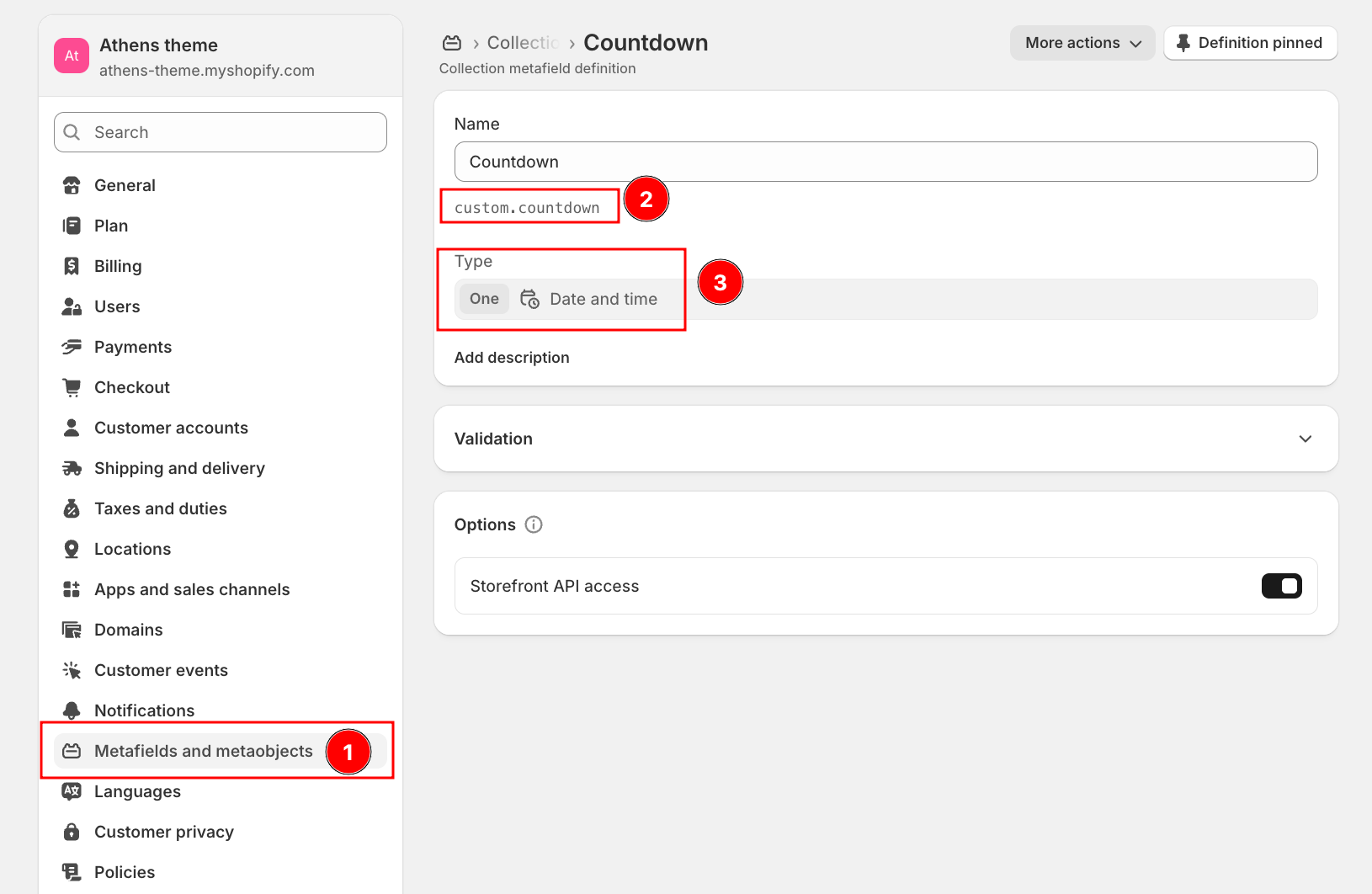
To display a countdown timer in your collection banner, create a Collection metafield named Countdown with the namespace and key custom.countdown. Set its type to Date and time. After creating the metafield, you can add a future date to any collection where you want the countdown to appear. The theme will automatically detect this value and show the timer in the banner. The screenshot below shows how to set up the metafield in your Shopify admin.
Product grid

Products per page: The number of products displayed on each page before pagination kicks in. Accepts a value between 6 and 48 (default 24).
Layout
Product layout: Choose how products are displayed. Grid (the default) lays out products in a typical product card grid. Rows keeps the same product card but lays it out horizontally, one product per row. Compact rows is a condensed list, useful for catalogs with many products or for stores where customers scan by name and price rather than by image.
Enable layout switcher: Lets shoppers switch between Grid, Rows, and Compact rows themselves on the storefront. Their choice is remembered across pageviews. Disabled by default.
Number of columns on desktop: Sets the number of product columns on desktop (3, 4, or 5; 4 by default). Applies only to the “Grid” layout — the number of columns on mobile is controlled globally under Theme settings > Product grid.
Rows layout density: Sets how tightly rows are packed. Available options: Compact (default) and Comfortable. Applies only to the “Compact rows” layout.
Row highlight color: The color used to highlight a product row when a customer hovers over it. Supports transparency. Applies only to the “Compact rows” layout.
Filtering and sorting
Enable filtering: Displays the filters for the collection. The filters themselves are configured in your Shopify admin under Navigation > Filters. Enabled by default.
Enable filters toggle: Gives your customers the option to show and hide the filters at will, so they are less distracted while looking for the perfect product. Requires that filtering is enabled.
Filters toggle default: Select whether the filters are Visible or Hidden by default when the filters toggle is enabled. The state is remembered for each user and across pageviews.
Hide empty filters: Hides filters when they contain no products, instead of displaying them as disabled.
Show product count on filters: Displays the number of matching products next to each filter value. Enabled by default.
Filters expanded by default: How many filters, counting from the top, start out expanded. Set to 0 to collapse all of them, or to 25 (Shopify’s maximum) to expand all of them. Filters with an active selection always stay open regardless of this setting.
Show product count: Displays the total number of products in the collection (or in the filtered result) above the grid. Enabled by default.
Enable sorting: Displays the sort-by dropdown, letting customers reorder the collection. Enabled by default.
Enable sticky filters bar on mobile: When enabled, the filters bar remains fixed to the top of the viewport as your customers scroll on mobile devices.
Filters bar color scheme: Select one of the predefined color schemes as defined in Theme settings > Colors for the filters and sorting bar. For more information regarding the color schemes please refer to our article about creating your own color scheme.
Product card
These options only apply to the “Grid” products layout.
Show vendor: Toggles the visibility of the product’s vendor on the product card.
Show SKU: Toggles the visibility of the product’s SKU on the product card.
Show stock status: Toggles the visibility of the product’s stock status (e.g. in stock, low stock, sold out) on the product card.
Show product rating: Toggles the visibility of the product’s rating on the product card. Requires you are using a product rating app.
Additional product card options are shared across the theme and live under Theme settings > Product grid (such as the number of columns on mobile and the Image ratio), Theme settings > Currency and prices (the Taxed price suffix, e.g. “inc VAT”), and Theme settings > Badges (the Sale badge text and the Last items threshold).
Side menu
You can optionally provide additional navigation by displaying a menu above the filters.
Heading: The title displayed above the side menu.
Menu: Select the menu to be displayed. Menus are managed in your Shopify admin under Navigation. Leave empty to hide the side menu.
Side menu sub-menus expand on arrow click: When enabled, only the arrow of a menu item will expand its sub-menu, so that clicking the item itself follows its link.
Section spacing
The section spacing settings give you the option to adjust the top & bottom section spacing values. Use the Configure spacing for option to switch between the Desktop and Mobile values, each of which has its own Top spacing and Bottom spacing setting. Please note: If you select a color scheme with a background color, these settings will affect the spacing between the top or bottom of the section and the content of the section.
Inline banner blocks
You can create banners that will appear inbetween producs or rows of products. They can be useful for display helpful tips or links to your customers, or even up-sell higher-end products. Inline banners come into two flavors: Card banners and Row banners. You can insert both by adding the respective block into the Product grid section.

Card banners occupy the equivalent space of a product card, and appear before the product whose position you set by setting the Position option. For example, a card banner with its position set to 1 will appear before the first product. If the collection contains less products than a banner’s position, then that banner will not be displayed.
Row banners occupy a full row between rows of products, and appear after the row whose position you set by setting the Row position option. First and Last will make the banner always appear before and after the products, respectively. For numbered positions, there must be at least that many rows of products, plus one more, for the banner to appear. For example, in a 3-column layout, a banner with row position of “1” needs 4 products in order to appear. This is to avoid having a numbered banner appear immediately before a Last banner.
Row position: The banner will appear after the specified row number. First and Last will make the banner always appear before and after the products, respectively. For numbered positions, there must be at least that many rows of products, plus one more, for the banner to appear. For example, in a 3-column layout, a banner with row position of “1” needs 4 products in order to appear. This is to avoid having a numbered banner appear immediately before a Last banner.
Both types of banner blocks have the following settings:
Hide banner when the collection is filtered: Enabling this option will make the banner appear only on unfiltered collections.
Background image: Set an image for the particular banner. It will be displayed as the background image for the banner.
Overlay background: Optional gradient background to be used as an overlay (over the image and under the content).
Heading: The title of the banner.
Text: The text content the banner.
Link label + Link: With these settings you can create a button that will link to another area of your store.
Color scheme: Select one of the predefined color schemes as defined in Theme settings > Colors. For more information regarding the color schemes please refer to our article about creating your own color scheme.
Subcollections

This section displays subcollections for the particular collection. Please refer to this guide to set up your subcollections if you plan on using this section.
The section has the following settings:
Image ratio: This option allows you to select the ratio of the thumbnails that will appear on the collection cards. “Adapt to image” means that the ratio will be the inherent ratio of the image (the default option). Portrait, Square, and Landscape will force the images to be displayed as portrait, square, or landscape ratios respectively.
Show title: Whether to show the title of the collection in the card or not.
Show number of products in collection title: Whether to show the number of products in parentheses next to the title. If the title is disabled, this has no effect.
Desktop layout: With the “Grid” option you can create a typical grid layout of collection cards. A “Slider” option is also available that lets you create a simple slider layout. For this to work correctly, the number of collections added in this section must be greater than the number of collections visible as set by the following setting Number of columns on desktop.
Number of columns on desktop: Sets the number of columns (1 through 8).
Stack on mobile: By default, Athens will try to create a flexible scrollable horizontal list of collection cards on mobile. If you prefer to create a vertical list though, enable this option.
Can't find what you are looking for? Feel free to submit a request.