Truly fine
Documentation.
Collection list section
Last update:

The collection list is a flexible section that gives you the ability to showcase your collection in multiple ways. Here’s a breakdown of its settings.
Section settings
Heading: Set a title for this section. This is optional.
Link label + Link: With these settings you can create a link that will appear at the top right corner of your collection list section. For example if you have used this section to showcase a list of popular collections, you can add a link to your “All collections” page.
Collection card
Card type: Choose between “Card”, “Overlay card” and “Padded card” type for your collection cards. The “Card” type features a bordered appearance (making the posts look like a card), “Overlay card” type shows the card’s text content over the card’s image, and the “Padded card” type adds background and padding around the entire card, including the image.
Card ratio: This option allows you to select the ratio of the card that will appear on the section. “Adapt to first image” (default option) means that the ratio of all cards will be the inherent ratio of the first card’s image. Square, Portrait and Landscape will force the images to be displayed as squares, portraits or landscapes respectively.
Show title: Toggles the visibility of the collection title.
Show description: Toggles the visibility of the collection description (If available).
Show button: Toggles the visibility of the collection button with a link to the collection page.
Entire card is clickable on desktop: The entire card is clickable (Desktop only). This feature is enabled on mobile by default.
Layout
Desktop layout: With the “Grid” option you can create a typical grid layout of collections. A “Slider” option is also available that lets you create a simple slider layout. For this to work, the number of collections added in this section must be greater than the number of collections visible as set by the following setting Number of columns on desktop.
Number of columns on desktop: Sets the number of columns (1,2,3 or 4).
Stack on mobile: By default, Maranello will try to create a flexible scrollable horizontal list of collections on mobile. If you prefer to create a vertical list of collections though, simply enable this option.
Colors
Color scheme: Select one of the predefined color schemes as defined in Theme settings > Colors. For more information regarding the color schemes please refer to our article about creating your own color scheme.
Section spacing
The section spacing settings gives you the option to adjust the top & bottom section spacing values. Please note: If you select a color scheme with a background color, these settings will affect the spacing between the top or bottom of the section and the content of the section.
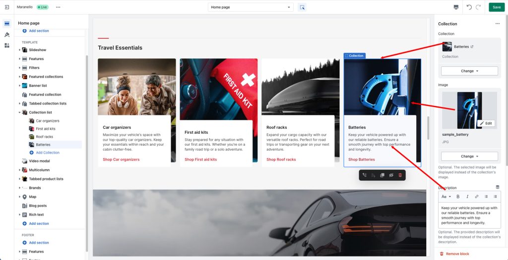
Collection block

This section consists of “Collection” blocks, with the following settings:
Collection: Set the collection for the particular block.
Image: Optionally override the collection’s main image with a custom one for this block.
Description: Optionally override the collection’s description.
Button label: Optionally use a different button text.
Display button as text link: When checked, a link will be displayed instead of a button.
Button color scheme: Select one of the predefined color schemes as defined in Theme settings > Colors.
Heading size: The size of the collection’s title.
Mobile layout
Heading size: The collection’s title size in mobile devices.
Can't find what you are looking for? Feel free to submit a request.