Truly fine
Documentation.
Tabbed product lists section
Last update:
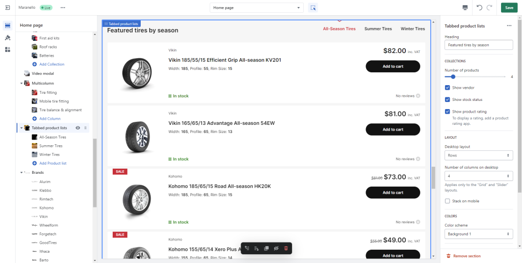
The Tabbed Product Lists section is a flexible section that gives you the ability to showcase multiple collections and products from those collections in a tabbed user interface.
Section settings

Heading: Set a title for this section. This is optional.
Collections
Number of products: Select up to 12 products to be shown for each collection.
Show vendor: Whether to show the vendor in each product card above the product title.
Show stock status: Whether to show the stock status of each product.
Show product rating: Whether to show the product’s rating. Please note you will need a rating app for this to work. Learn more about product ratings here.
Layout
Desktop layout: With the “Grid” option you can create a typical grid layout of products. The “Rows” option, shows each block in a separate row. A “Slider” option is also available that lets you create a simple slider layout. For the slider to work, the number of products selected in this section must be greater than the number of products visible as set by the following setting Number of columns on desktop.
Number of columns on desktop: Sets the number of columns (3 or 4).
Stack on mobile: By default, Maranello will try to create a flexible scrollable horizontal list of products on mobile. If you prefer to create a vertical list of products though, simply enable this option.
Colors
Color scheme: Select one of the predefined color schemes as defined in Theme settings > Colors. For more information regarding the color schemes please refer to our article about creating your own color scheme.
Section spacing
The section spacing settings give you the option to adjust the top & bottom section spacing values. Please note: If you select a color scheme with a background color, these settings will affect the spacing between the top or bottom of the section and the content of the section.
Product List block
Collection: Select the collection you wish to showcase in the product list block.
Tab label: Override the collection’s title (optional).
Products: Optionally select products manually for the particular block instead of having them automatically populated from the selected collection.
Can't find what you are looking for? Feel free to submit a request.