Truly fine
Documentation.
Branded collection
Last update:
Brand loyalty is a big thing among consumers, especially in the tools and hardware section where many professionals tend to only shop by brand. The branded collections page will help you create inventory listings for each brand separately to make the shopping experience easier for customers shopping by brand.
Using the template

To use the Branded collection template navigate to Collections under Products in your Shopify Admin, pick a collection and set to it the brand template from the Theme template drop down on the right hand side of the screen below the Collection’s image.
Template contents
The template is similar to the default Collection template, but differs in the appearance of the Collection banner section, as it’s better suited to display brand information.
Collection banner
Section Settings
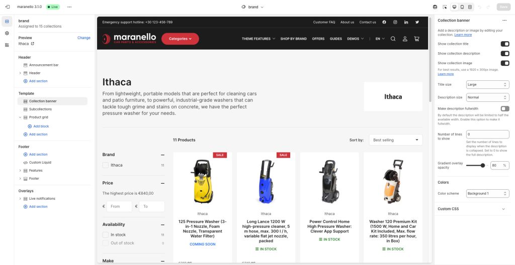
This section displays a banner above the subcollections section. In order for all the necessary information to show up you will need to set a Title, a Description and a Collection image for your Collection. You can do that from the Collections menu under Products in your Shopify Admin.
Show collection title: Enable this option to display the collection’s title at the top of the section.
Show collection description: Toggles the visibility of the collection description.
Show collection image: Toggles the visibility of the collection image.
Title size: Adjust the size of your title. Available options: Small, Normal, Large, Extra large.
Description size: Select one of the three font sizes (Small, Normal, Large, Extra large) for the collection’s description.
Make description fullwidth: When enabled, the collection’s description will span the full width of the banner. By default, the description will be limited to half the available width.
Number of lines to show: Set the number of lines to display when the description is collapsed. Set to 0 to show the full description.
Gradient overlay opacity: This setting is not applicable on the branded collcetion template, it is used only on the default collections template.
Colors
Color scheme: Select one of the predefined color schemes as defined in Theme settings > Colors. For more information regarding the color schemes please refer to our article about creating your own color scheme.
Subcollections
This section will display the collection’s sub-collections, if any. Learn how to set up sub-collections.
Collection Card
Image ratio: This option allows you to select the ratio of the thumbnails that will appear on the cards. Adapt to image (default) means that the ratio will be the inherent ratio of the image. Portrait, Square, and Landscape will force the images to be displayed as portrait, square, or landscape ratios respectively.
Show title: Toggles the visibility of the subcollection title.
Show number of products in collection title: Toggles the visibility of the number of products next to the subcollection’s title.
Layout
Desktop layout: With the “Grid” option you can create a typical grid layout of products. A “Slider” option is also available that lets you create a simple slider layout. For this to work, the number of selected subcollections in this section must be greater than the number of columns as set by the following setting Number of columns on desktop.
Number of columns on desktop: Sets the number of columns (2-10).
Stack on mobile: By default, Maranello will try to create a flexible scrollable horizontal list of products on mobile. If you prefer to create a vertical list of products though, simply enable this option.
Colors
Color scheme: Select one of the predefined color schemes as defined in Theme settings > Colors. For more information regarding the color schemes please refer to our article about creating your own color scheme.
Product grid
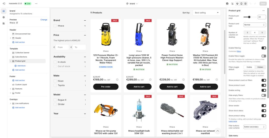
Products per page: The number of visible products per page (6-48).
Product card type: There are two card types. With “Normal” you can create a typical grid layout of products, and “Row” which displays each product card in a separate row.
Number of columns on desktop: Sets the number of columns (3-5). This option only applies on the “Normal” product card type layout.
Enable filtering: Toggles the visibility of filters section on the sidebar.
Enable filters toggle: Enables a toggle button that will allow customers to hide and reveal the filters on the sidebar (applies for wide screens only).
Filters toggle default: Set the default visibility state for the filters toggle to Visible (default) or Hidden. The state will be remembered for each user and across pageviews.
Hide empty filters: Enable this setting if you’d like to hide the filters that contain no products instead of disabling them.
Show product count on filters: Displays the number of products that apply on each filter.
Show product count: Toggles the visibility of the total number of collection’s products on the top of the product grid.
Enable sorting: Toggles the visibility of the product sorting option on the top right of the product grid.
Show vendor: Whether to show the vendor in each product card above the product title.
Show stock status: Whether to show the stock status of each product.
Show product rating: Whether to show the product’s rating. Please note you will need a rating app for this to work. Learn more about product ratings here.
Filter buttons color scheme: Controls the color scheme of the filter action buttons. Select one of the predefined color schemes as defined in Theme settings > Colors. For more information regarding the color schemes please refer to our article about creating your own color scheme.
Side menu
Selecting a menu in the “Menu” setting will display that menu above the product filters on the sidebar. It is helpful when you have a lot of collections and you wish to display a list to filter them easily from the sidebar.
Heading: Set a title for this section (optional).
Menu: Choose the menu to be displayed on the sidebar. You can create and modify menus via the Online Store > Navigation page.
Side menu sub-menus expand on arrow click: When this option is disabled, menu entries that have sub-menu entries cannot be visited, as clicking/pressing on the item expands the sub-menu. When enabled, only the arrow on the side expands the sub-menus, and the entries become clickable.
Section spacing
The section spacing settings give you the option to adjust the top & bottom section spacing values.
Inline banner blocks
You can create banners that will appear in between products or rows of products. They can be useful for display helpful tips or links to your customers, or even up-sell higher-end products. Inline banners come into two flavors: Card banners and Row banners. You can insert both by adding the respective block into the Product grid section.

Card banners occupy the equivalent space of a product card, and appear before the product whose position you set by setting the Position option. For example, a card banner with its position set to 1 will appear before the first product. If the collection contains less products than a banner’s position, then that banner will not be displayed.
Row banners occupy a full row between rows of products, and appear after the row whose position you set by setting the Row position option. First and Last will make the banner always appear before and after the products, respectively. For numbered positions, there must be at least that many rows of products, plus one more, for the banner to appear. For example, in a 3-column layout, a banner with row position of “1” needs 4 products in order to appear. This is to avoid having a numbered banner appear immediately before a Last banner.
Row position: The banner will appear after the specified row number. First and Last will make the banner always appear before and after the products, respectively. For numbered positions, there must be at least that many rows of products, plus one more, for the banner to appear. For example, in a 3-column layout, a banner with row position of “1” needs 4 products in order to appear. This is to avoid having a numbered banner appear immediately before a Last banner.
Both types of banner blocks have the following settings:
Background image: Set an image for the particular banner. It will be displayed as the background image for the banner.
Overlay background: Optional gradient background to be used as an overlay (over the image and under the content).
Heading: The title of the banner.
Text: The text content the banner.
Link label + Link: With these settings you can create a button that will link to another area of your store.
Color scheme: Select one of the predefined color schemes as defined in Theme settings > Colors. For more information regarding the color schemes please refer to our article about creating your own color scheme.
Visibility
Hide banner when the collection is filtered: Enabling this option will make the banner appear only on unfiltered collections.
Hide banner if…: Enable this option when the section’s fields are bound to dynamic sources (i.e. metafields or metaobjects). The section will be hidden on the front-end if the most important field(s) are empty, i.e. when there is no meaningful output.
Can't find what you are looking for? Feel free to submit a request.