Truly fine
Documentation.
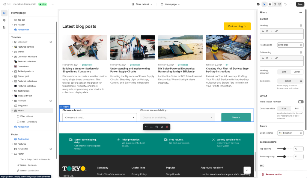
Filters section
Last update:
This section was introduced in version 4.0The Filters section is an advanced section that gives you the ability to present to your customers a list of filters where they can start and fine tune their shopping journey on your store.
Section settings
Content
Heading: Add a title for the section (optional).
Heading size: Adjust the size of your heading to make your message stand out. Available options: Small, Normal, Large, Extra large, and Extra extra large.
Subheading: Set a subtitle for this section. Also optional.
Collections: Optional. The initial collections to start the filters from. This can be left empty if you want your filters to apply to the entire range of the collections in your shop. Note: If you select only one collection the collection dropdown will be hidden (as there are no more than one collections to choose from).
Collections label: The label of the collections dropdown, when visible.
Collections tooltip: An optional tooltip that can be displayed as part of the collection’s dropdown label.
Layout
Headings alignment: Align the heading and subheading left, center, or right.
Make section fullwidth: This option, when enabled, will turn the section into a fullwidth one.
Container width: Select either “Wide” or “Full” for the section’s container width. Choosing “Wide” extends the section a few pixels beyond the page’s boundaries on the left and right, whereas “Full” expands the section to cover the entire width of the viewport. This setting is designed to work along with a color scheme that contrasts the base background (i.e. Accent colors or Background 2).
Colors
Color scheme: Select one of the predefined color schemes as defined in Theme settings > Colors. For more information regarding the color schemes please refer to our article about creating your own color scheme.
Section spacing
The section spacing settings gives you the option to adjust the top & bottom section spacing values. Please note: If you select a color scheme with a background color, these settings will affect the spacing between the top or bottom of the section and the content of the section.
SEO
Heading tag: Select the appropriate heading level (H1, H2, or H3) based on how you want the section title to appear.
Visibility
Show section on desktop: Enable or disable the section’s visibility on desktop devices.
Show section on mobile: Enable or disable the section’s visibility on mobile devices.
Hide section if…: Enable this option when the section’s fields are bound to dynamic sources (i.e. metafields or metaobjects). The section will be hidden on the front-end if the most important field(s) are empty, i.e. when there is no meaningful output.
Adding filters
The first thing that you need to make sure of is to have product filters to your collections. Please take a moment to read through the guide here on how to set those up, as they are going to be necessary (and also important for your store in general).
Once you’ve set up your metafields and enabled them as filters you can add each filter as a block on the Filters section. Simply click “Add filter” (or click an existing one to edit it), see screenshot below for reference.
Filter block
Each block represents one of your filters. Let’s take a look at the blocks’ settings:
Filter name: This is the name of the filter, and the text you input here must be exactly the same as the name of the filter on your store (case sensitive).
Placeholder text: Optionally add a placeholder text for the filter’s dropdown label.
Label tooltip: An optional tooltip that can be displayed as part of the filter’s dropdown label.
Can't find what you are looking for? Feel free to submit a request.