Truly fine
Documentation.
Tabbed content section
Last update:
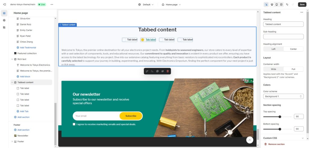
The “Tabbed Content” section is designed for organizing diverse content into tabs with custom labels, offering a clean and efficient user interface for seamless browsing.

Section settings
Heading: Set a title for this section. This is optional.
Sub-heading: Set a sub-heading for this section. This is optional.
Heading alignment: Choose whether you want the heading and sub-heading of this section to be left or center aligned.
Layout
Container width: Select either “Wide” or “Full” for the section’s container width. Choosing “Wide” extends the section a few pixels beyond the page’s boundaries on the left and right, whereas “Full” expands the section to cover the entire width of the viewport. This setting is designed to work along with a color scheme that contrasts the base background (i.e. Accent colors or Background 2).
Colors
Color scheme: Select one of the predefined color schemes as defined in Theme settings > Colors. For more information regarding the color schemes please refer to our article about creating your own color scheme.
Section spacing
The section spacing settings gives you the option to adjust the top & bottom section spacing values. Please note: If you select a color scheme with a background color, these settings will affect the spacing between the top or bottom of the section and the content of the section.
Tab block
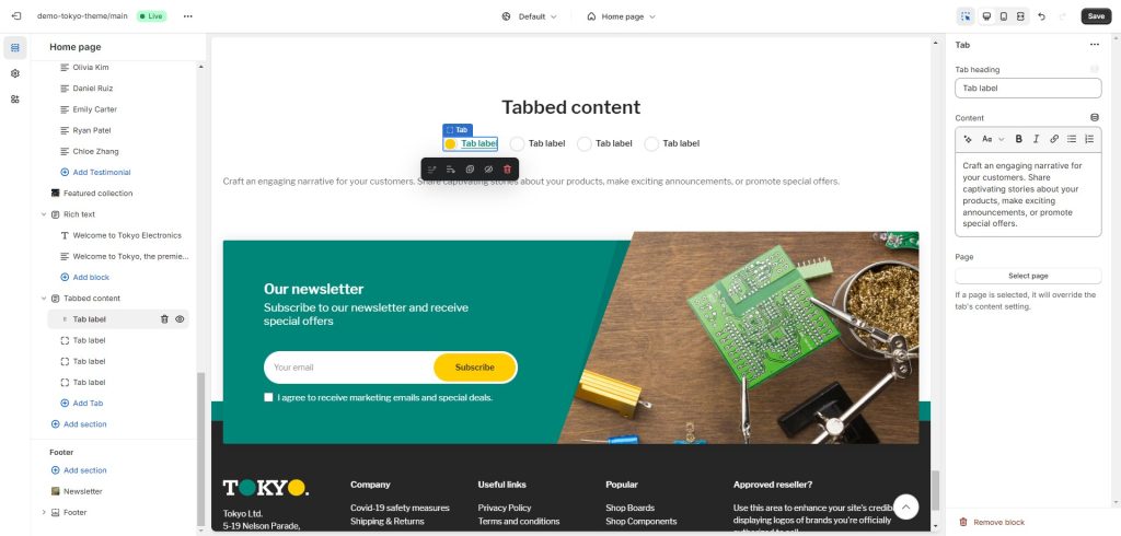
This section consists of “Tab” blocks, with the following settings:

Tab heading: The heading of the tab as displayed in the tabs’ navigation.
Content: The content of the tab.
Page: Additionally, you can choose to show the content of a page instead of using the “Content” setting.
Can't find what you are looking for? Feel free to submit a request.