Truly fine
Documentation.
Flexi – Features section
Last update:
This feature was introduced in version 4.3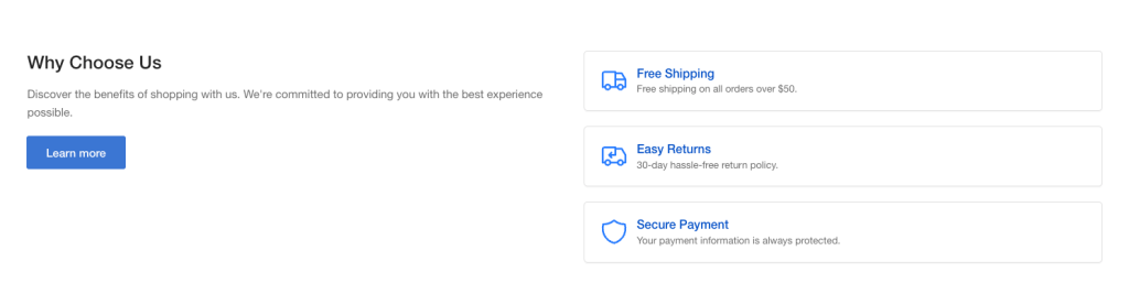
This highly flexible section (“flexi”) allows you to display a list of features in a variety of layouts it using reusable theme blocks.
The section is composed of one or two Column blocks. Each Column block contains one or more content blocks, such as a Feature, heading, text, etc.
Section settings
Layout
Show inline: When enabled, Feature blocks will be displayed inline, i.e. not in a “card” layout.
Colors
Feature card color scheme: Select one of the predefined color schemes for the feature cards, as defined in Theme settings > Colors. For more information regarding the color schemes please refer to our article about creating your own color scheme.
Color scheme: Select one of the predefined color schemes for the section, as defined in Theme settings > Colors. For more information regarding the color schemes please refer to our article about creating your own color scheme.
Section spacing
The section spacing settings gives you the option to adjust the top & bottom section spacing values separately for desktop and mobile. Please note: If you select a color scheme with a background color, these settings will affect the spacing between the top or bottom of the section and the content of the section.
Visibility
Show section on desktop: Enable or disable the section’s visibility on desktop devices.
Show section on mobile: Enable or disable the section’s visibility on mobile devices.
Column block
This block has no settings. Add one or two column blocks to create a 1 or 2-colum layout respectively. Each column may contain multiple content blocks:
Heading block
Heading text: The text of the heading.
Heading tag: Select the appropriate heading level (H1, H2, H3, or H4) based on how you want the title to appear.
Heading size: Adjust the size of your heading to make your message stand out. Available options: Small, Normal, Large, Extra large, and Extra extra large.
Rich text block
Text content: The text (multi line) content of the block.
Text size: Adjust the size of your text to make your message stand out. Available options: Small, Normal, and Large.
Button block
Button label and Link: Customize the call to action button with a specific label and link it to any part of your store, such as a collection page, a contact form, or another desired location.
Button style: Optionally display the button as a text link.
Open link in new window: When enabled, the link will open in a new windows/tab.
Media block
Image: Select the image to be displayed.
Self hosted video: Upload a custom mp4 for your video.
Video URL: A YouTube or Vimeo URL. You can simply paste either the link from your browser’s bar or the URL that YouTube or Vimeo gives when attempting to share a video. Note that if both self-hosted and external URL are chosen, the self-hosted will take priority. The image (if set) will be used as the video’s cover.
Alt text / Video description: Describe the image/video for screen readers. Leave blank to use the image’s built-in description.
Feature group block
The feature group block controls the behaviour of one or more Feature blocks.
Columns per row (desktop): Select between a 1 or 2-column layout.
Icon size: Change the features’ icon size to small or large.
Feature block
Icon: Set an icon for the feature box (optional). For example, if you want to create a support card, typically you would want to choose the “Phone” icon. If you want to choose your own image for the icon, select Custom icon.
Custom image: If an icon is not desired you can optionally upload your own image for the feature box. Recommended size for best viewing is 80×80.
Title: The title of the feature box. In the previous example of the support card it could be your phone number or an email.
Description: A brief description of the feature.
Can't find what you are looking for? Feel free to submit a request.