Truly fine
Documentation.
Header
Last update:
The header section controls the announcement bar, rotating text bar, and the master header section of your shop.
Announcement bar
Section settings
Text + Link: Optionally add a brief label of text to be displayed on the left area of the announcement bar. It supports a link where the entire section will be linked to.
Menu: Optionally add a helper menu to be displayed on the right area of the announcement bar.
Text size: Controls the size of the text. Available options: Extra Small, Small, Normal, Large.
Show social media icons: Enable this if you want the social media icons to be displayed on the right column of the announcement bar.
Colors
Color scheme: Select one of the predefined color schemes as defined in Theme settings > Colors. For more information regarding the color schemes please refer to our article about creating your own color scheme.
Remove bottom border: Remove the bottom border of the announcement bar. Useful if you want to visually separate it from the header in some color scheme configurations.
Section spacing
The section spacing settings gives you the option to adjust the top & bottom section spacing values (padding) in rems.
Visibility
Show section on desktop: Enable or disable the section’s visibility on desktop devices.
Show section on mobile: Enable or disable the section’s visibility on mobile devices.
Hide section if…: Enable this option when the section’s fields are bound to dynamic sources (i.e. metafields or metaobjects). The section will be hidden on the front-end if the most important field(s) are empty, i.e. when there is no meaningful output.
Rotating text bar
Section settings
Auto-rotate slides: When enabled, allows the text slides within the bar to automatically transition at a set interval.
Rotate every: Specify the duration in seconds for how long each text slide should remain visible before rotating to the next one.
Show arrow navigation: Optionally display arrows for manual navigation through the text slides, enhancing user interaction.
Text size: Controls the size of the text. Available options: Extra Small, Small, Normal, Large.
Colors
Color scheme: Select one of the predefined color schemes as defined in Theme settings > Colors. For more information regarding the color schemes please refer to our article about creating your own color scheme.
Remove bottom border: Toggle this setting to remove the bottom border of the text bar for a cleaner appearance.
Section spacing
The section spacing settings gives you the option to adjust the top & bottom section spacing values (padding) in rems.
Visibility
Show section on desktop: Enable or disable the section’s visibility on desktop devices.
Show section on mobile: Enable or disable the section’s visibility on mobile devices.
Header
Logo settings
Image: Upload the image file of your logo in this area to set it globally on the header of every page.
SVG Image: (Deprecated) Paste the code of an SVG image if you prefer to have an .svg file as your logo. This will override any image uploaded in the Image setting above. Note: The “Image” field above accepts SVG files, so you can simply disregard this setting and upload your svg file directly.
Custom width: Adjust the maximum width of your logo.
Contact details
Contact details: Using the Heading and Subheading fields you can set some additional contact info on the header that will be displayed next to the search bar.
Vertical tabs menu
Menu: Optional. Select a menu that includes 3 levels of items, to display as a fixed, vertical mega menu. The menu’s trigger/button will be displayed as the first main menu entry.
Button label: The menu’s trigger button text. Optional.
Icon: Select whether the button will display a menu icon (hamberger), or no icon at all.
Button background color: The button’s background color. Leave empty to use the main menu’s colors.
Button text color: The button’s text color. Leave empty to use the main menu’s colors.
Navigation
Main Menu: The main menu of your shop.
Secondary Menu: The secondary menu of your shop. This will be displayed on the main menu area but will be fixed positioned on the right. This is helpful when you want to make a menu item stand out for a particular offer.
Main navigation font size: Control the font size of the main navigation on wide screens.
Make main navigation uppercase: Enabling this will display the main navigation as uppercase.
Make menu items center aligned: Only applies in alternative header layout and if a secondary menu is not set.
Mobile menu: Optionally you can override the Main Menu as the menu that mobile users will see. Helpful in case you want your mobile menu to be simpler or different. It is highly recommended that you leave this empty and use the Main Menu instead for SEO purposes, since Google predominantly uses the mobile version for indexing. More info on this here.
Mobile sub-menus expand on arrow click: This controls how your mobile menu’s submenus will open. If left unchecked the entire top level menu item will be clickable and expand its submenu. If checked, only the arrow will expand its submenu, and the menu item will navigate to its link.
Mobile menu position: Sets the position of the mobile navigation menu. Available options: Left or Right.
Menus should use the font from: Choose whether you want the font family of the body or headings for your menus.
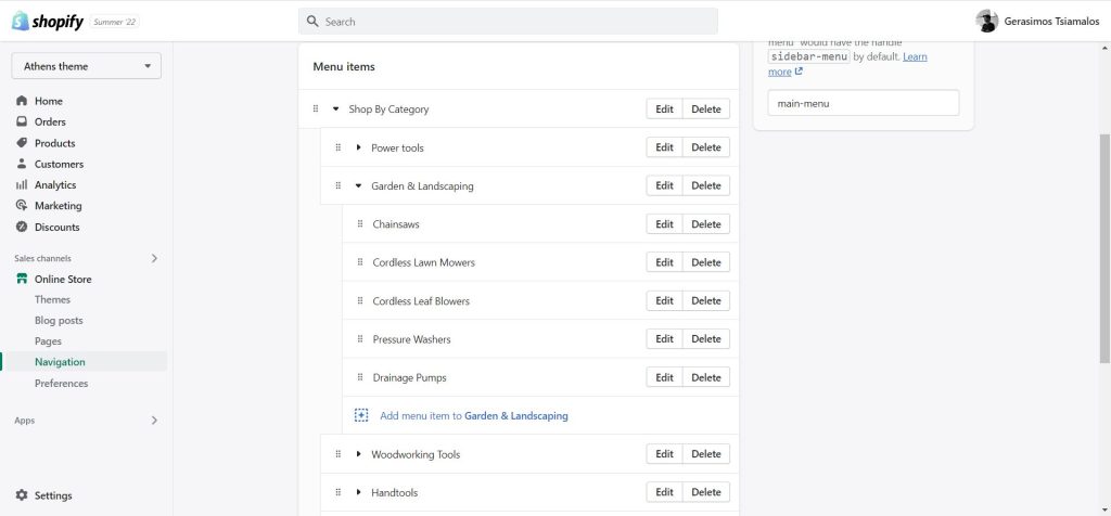
Mega menu
Adding a mega menu to your main navigation is simple. Under the Header section click on “Add Mega menu”.
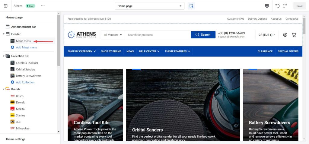
Click on the Mega menu item enter the exact name of the first level menu item you would like to transform to a mega menu.
For example: Your main navigation consists of “Home”, “Shop by category”, “Shop by brand”, “New arrivals”, “Contact”. If you wanted to have “Shop by category” and its sub-menu to be the mega menu you would type “Shop by category” in the Menu item field.

Now every sub-menu on that menu item will be turned into a list of menu items.
Please note: For a mega menu to make sense, your mega menu item top level item should have two more levels of items.
You can also add a Side item with an Image, Heading, a brief description (Text) and a Link to point to. The side item of your mega menu will always be displayed as the last item in the menu.
Language & country selectors
Control the visibility of the language and country selectors. Please note that these settings will need configuration in your store’s language and payment settings respectively.
You can read about setting up multiple languages and selling across multiple currencies in the Shopify documentation.
Mini cart
Mini cart icon: Choose between three different icons for the mini cart toggle on the header.
Redirect to cart page after adding a product to the cart: By default, the theme will open the mini cart whenever a product is added to the cart. Enabling this option will make it so that the customer is immediately redirected to the cart page after adding a product to the cart.
Display total price in the icon: Display the cart’s total price next to the icon in the header.
Search
Search display: Control the visibility of the search bar. You can have it shown or completely hidden, or visible by clicking on an icon. “Show as icon on mobile” will show an icon on mobile, but the full search bar on desktop.
Enable typewriter effect: When enabled, the search bar’s placeholder text will animate with a typewriter-looking effect, between the first and second search phrases.
Account
A customer account icon is displayed on the header, that allows customers to log in and access their accounts. You can toggle the visibility of the customer account icon by going to Settings > Customer accounts, and enable or disable the Show sign-in links setting.
Customer account menu: Set the menu displayed on the account component when clicked. The menu “Customer account main menu” is selected by default, which you can edit via Content > Menus.
Custom action
Show custom action: When enabled, a custom icon will be displayed along with the rest of the action icons (e.g. account, minicart).
Label: Provide a written description of the action. This text is used for accessibility reasons and is not visible on page.
Link: Set the URL that the action will link to.
Icon: Select an icon from the predefined list, or choose Custom icon to use your own file.
Layout
Sticky header: Make your shop’s header appear when scrolling up. Please note: This feature is disabled in the designer mode for practicality, it will be enabled in your actual shop pages.
Sticky header always on: When the store’s sticky header is enabled, the header will remain visible at the top of the viewport permanently (i.e. not just when your customer scrolls up).
Collapse navigation: When enabled and the header is in a stuck state, the header menu will be collapsed under a mobile menu-style button next to the logo.
Colors
Each area of the header can be customized to its own color scheme. Header, Navigation, Sub-menus, and Mobile navigation.
Select one of the predefined color schemes as defined in Theme settings > Colors. For more information regarding the color schemes please refer to our article about creating your own color scheme.
Remove navigation’s border: Remove the top and bottom border from the main navigation menu strip.
Section spacing
The section spacing settings gives you the option to adjust the top & bottom header spacing values (padding) in rems.
SEO
Logo tag on homepage: Choose whether you want the logo to be wrapped in a h1 or span element on the homepage. The logo is wrapped in a span element on all other pages.
Auxiliary announcement bar
Section settings
Text + Link: Add a brief label of text to be displayed on on the auxiliary announcement bar. It supports a link where the entire section will be linked to. Please note that when this is empty the auxiliary announcement bar will not be displayed.
Text size: Controls the size of the text. Available options: Extra Small, Small, Normal, Large.
Colors
Color scheme: Select one of the predefined color schemes as defined in Theme settings > Colors. For more information regarding the color schemes please refer to our article about creating your own color scheme.
Remove bottom border: Toggle this setting to remove the bottom border of the text bar for a cleaner appearance.
Section spacing
The section spacing settings gives you the option to adjust the top & bottom section spacing values (padding) in rems.
Visibility
Show section on desktop: Enable or disable the section’s visibility on desktop devices.
Show section on mobile: Enable or disable the section’s visibility on mobile devices.
Features
The header features section is the same as the global Features section. It consists of multiple feature blocks with the following settings:
- Icon: Set an icon for the feature box (optional). For example, if you want to create a support card, typically you would want to choose the “Phone” icon.
- Image: If an icon is not desired you can optionally upload your own image for the feature box. Recommended size for best viewing is 80×80.
- Heading: The heading of the feature box. In the previous example of the support card it could be your phone number or an email.
- Text: A brief description of the feature.
Navigation “Badge” block
Since Athens’ version 2.3 there is an additional block for the header called the “Badge“. Using it, you can add badges on top of first-level menu items on the main menu.
Settings
Menu item: Enter the menu item you want the badge to appear over. Case sensitive.
Badge label: The text you want the badge to display.
Text color / Background color: The custom colors you wish the badge to have.
Can't find what you are looking for? Feel free to submit a request.