Truly fine
Documentation.
Footer
Last update:
The footer area is controlled by three sections: Features, Newsletter, and Footer. Additionally, starting from version 2.0, you can also add an Image Banners section.
Features section
The footer features section is the same as the global Features section. It consists of multiple feature blocks with the following settings:

- Icon: Set an icon for the feature box (optional). For example, if you want to create a support card, typically you would want to choose the “Phone” icon.
- Image: If an icon is not desired you can optionally upload your own image for the feature box. Recommended size for best viewing is 80×80.
- Title: The title of the feature box. In the previous example of the support card it could be your phone number or an email.
- Text: A brief description of the feature.
Newsletter section
Using the newsletter section you can create a flexible form field to acquire new email leads from your customers.
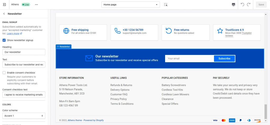
Show newsletter signup: Hide or show the section.
Heading: The newsletter section’s heading.
Text: A brief description under the heading.
Consent checkbox: You can acquire consent from your users before they opt-in to your newsletter by enabling the “Enable consent checkbox” option.
Anyone that subscribes to this section will be automatically added to your “accepted marketing” customer list.
Remove top and bottom border: Remove the top and bottom border from the newsletter container.
Footer section
The footer section controls the very bottom area of your global store’s footer.

Footer blocks: This section accepts three block types (and up to four blocks): “Text”, “Menu”, and “Custom liqiuid“. Using those you can split content in your footer area up to 4 columns. The column adjustment is automated, meaning that if you choose to add 4 blocks the resulting content will be split into 4 columns, one for each block.
- Show payment icons: Show or hide payment icons (credit cards or other payment methods) that you have declared you support in your store’s payment settings.
- Enable Follow on Shop: Whether to show the “Follow on Shop” badge. Note that this requires Shopify payments to be active. For more information on Follow on Shop please go through the official Shopify guide.
- Show social media icons: Control the visibility of your social media icons in the footer. You can read more about how to set up social media icons here.
Image banners
The Image Banners section’s documentation can be found here. You can use this section to display any relevant graphic content about your store, such as credentials, certifications, etc.
All footer section settings
Colors
Color scheme: All footer sections support the selection of one of the predefined color schemes as defined in Theme settings > Colors. For more information regarding the color schemes please refer to our article about creating your own color scheme.
Section spacing
In the “Features” and “Newsletter” footer sections, the section spacing settings gives you the option to adjust the top & bottom section spacing values. Please note: If you select a color scheme with a background color, these settings will affect the spacing between the top or bottom of the section and the content of the section.
Can't find what you are looking for? Feel free to submit a request.