Truly fine
Documentation.
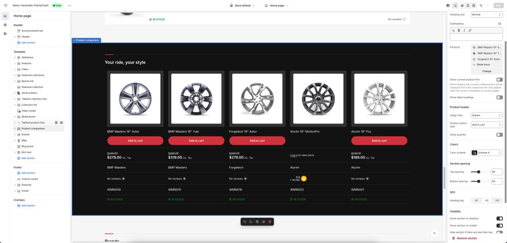
Product comparison section
Last update:
This section was introduced in version 5.0.0The product comparison section allow you to display a predetermined comparison of up to five products, to help your customers decide which product is perfect for their needs.
Section settings
Heading: Set a title for this section. This is optional.
Heading size: Adjust the size of your heading to make your message stand out. Available options: Small, Normal, Large, Extra large, and Extra extra large.
Subheading: Set a subtitle for this section. Also optional.
Products: Select up to 5 products to compare.
Show current product first: When this option is enabled, and the section is placed in a product template, the currently viewed product will by displayed first in the comparison table. This is especially userful when the other products (in the Products setting above) come from a metafield, in which case you can have different products to compare against the currently viewed one.
Show table headings: Shows/hides the table’s row headings.
Product header
Image ratio: The products’ image ratio. Choose between portrait, landscape, square, or automatic (adapt to image).
Product button type: Allows you to change the type of button that’s displayed below the product’s title. Add to cart displays a quantity picker and an “add to cart” button. View product displays a “view product” button that directs to the product page. Finally, Hide hides the button completely.
Show quantity: Shows/hides the quantity input, when the Product button type is set to Add to cart.
Colors
Color scheme: Select one of the predefined color schemes as defined in Theme settings > Colors. For more information regarding the color schemes please refer to our article about creating your own color scheme.
Section spacing
The section spacing settings gives you the option to adjust the top & bottom section spacing values. Please note: If you select a color scheme with a background color, these settings will affect the spacing between the top or bottom of the section and the content of the section.
SEO
Heading tag: Select the appropriate heading level (H1, H2, or H3) based on how you want the section title to appear.
Visibility
Show section on desktop: Enable or disable the section’s visibility on desktop devices.
Show section on mobile: Enable or disable the section’s visibility on mobile devices.
Hide section if…: Enable this option when the section’s fields are bound to dynamic sources (i.e. metafields or metaobjects). The section will be hidden on the front-end if the most important field(s) are empty, i.e. when there is no meaningful output.
Customizing the comparison fields
You can customize the comparison table in a similar way to how you customize your product pages, via the included blocks that allow you to add, remove, and customize the information displayed for each product. Each block represents a row in the comparison table. When a row is empty (there is no value/output for all products being compared) it is automatically hidden on the front-end. This results to only relevant information being displayed on the comparison table, depending on the products being compared. For example, you could add two Metafield blocks, one displaying a weight metafield, and the other displaying a filesize metafield. The weight metafiled that applies to physical products, not will not get displayed when all products compared are digital. Similarly, a filesize metafield only applicable to digital products, will not get displayed when all products compared are physical.
Available blocks
Vendor: Displays the product’s vendor.
SKU: Displays the product’s SKU.
Barcode: Displays the product’s barcode.
Product metadata: Displays the product’s vendor, SKU, and barcode, in a more compact format (single row).
Description: Displays the product’s description. You can set a character limit to truncate longer descriptions.
Price: Displays the product’s price, if applicable. Respects the catalog mode and login to view price features.
Rating: Displays the product’s rating. Requires you are using a product rating app.
Text: Displays a single-line text. Ideally used with dynamic sources.
Rich text: Displays a multiline, rich formatted text. Ideally used with dynamic sources.
Pickup availability: Display’s the product’s pickup availability status.
Stock availability: Display’s the product’s availability (in stock, out of stock, etc).
Image: Display’s a single image. Ideally used with dynamic sources.
Metafield: Display’s a single metafield value. In the metafield field, type the metafield’s prefix and key, e.g. custom.weight
Metafields: This block is similar to the “Details” block of the normal Product template and is use to display a list of metafields. To show your metafields, add a new line with the desired title and metafield prefix and key, separated by a colon and space “: “. Example:
Width: custom.width
Profile: custom.profile
Rim Size: custom.rim_size
Other: prefix.key
When a product doesn’t have a value defined for the specific metafield, it will not be displayed at all. This allows you to add different metafields for different kinds of products, and only the most appropriate ones will be displayed. For example, tires have a wheel size value and batteries have a capacity value. Since tires don’t have a capacity value, the capacity metafield will not be displayed on them.
Custom liquid: This block allows you allows you to implement your custom logic using Shopify’s Liquid templating language.
Variants: Displays the product’s options, out of which its variants are based. For example, it displays all the available product sizes and colors, but not each individual variant.
Range indicator: Displays a range indicator bar. Ideally used with dynamic sources.
Can't find what you are looking for? Feel free to submit a request.