Truly fine
Documentation.
Product comparison
Last update:
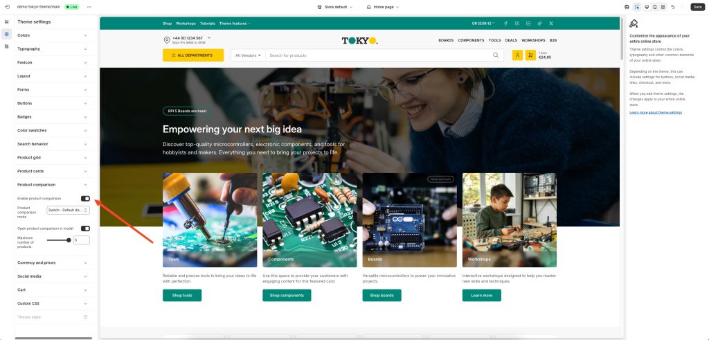
This feature was introduced in version 4.0.0The product comparison feature allows your customers to compare up to five products, to help them decide which one is perfect for their needs. It can be enabled from the theme’s settings, and is available in the collections and search page templates.
Theme settings
Enable product comparison: Allows you enable or disable the product comparison feature.
Product comparison mode: Select “Always enabled” to permanently enable the comparison feature. The other two options, “Switch – Default enabled” and “Switch – Default disabled” allows your customers to toggle the comparison mode on and off, starting from an enabled or disabled state respectively.
Open product comparison in modal: When enabled, the product comparison will appear in a modal, instead of navigating to a different page.
Maximum number of products: Allows you to set the maximum number of products (up to 5) that can be compared at the same time.
Customizing the comparison fields
You can customize the comparison table in a similar way to how you customize your product pages, via the included template.
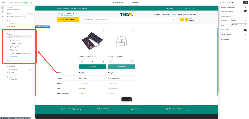
The section “Product comparison” provides options and blocks that allow you to add, remove, and customize the information displayed for each product. Each block represents a row in the comparison table. When a row is empty (there is no value/output for all products being compared) it is automatically hidden on the front-end. This results to only relevant information being displayed on the comparison table, depending on the products being compared. For example, you could add two Metafield blocks, one displaying a weight metafield, and the other displaying a filesize metafield. The weight metafiled that applies to physical products, not will not get displayed when all products compared are digital. Similarly, a filesize metafield only applicable to digital products, will not get displayed when all products compared are physical.
Available blocks
Vendor: Displays the product’s vendor.
SKU: Displays the product’s SKU.
Barcode: Displays the product’s barcode.
Product metadata: Displays the product’s vendor, SKU, and barcode, in a more compact format (single row).
Description: Displays the product’s description. You can set a character limit to truncate longer descriptions.
Price: Displays the product’s price, if applicable. Respects the catalog mode and login to view price features.
Rating: Displays the product’s rating. Requires you are using a product rating app.
Text: Displays a single-line text. Ideally used with dynamic sources.
Rich text: Displays a multiline, rich formatted text. Ideally used with dynamic sources.
Pickup availability: Display’s the product’s pickup availability status.
Stock availability: Display’s the product’s availability (in stock, out of stock, etc).
Image: Display’s a single image. Ideally used with dynamic sources.
Metafield: Display’s a single metafield value. In the metafield field, type the metafield’s prefix and key, e.g. custom.weight
Metafields: This block is similar to the “Details” block of the normal Product template and is use to display a list of metafields. To show your metafields, add a new line with the desired title and metafield prefix and key, separated by a colon and space “: “. Example:
Width: custom.width
Profile: custom.profile
Rim Size: custom.rim_size
Other: prefix.key
When a product doesn’t have a value defined for the specific metafield, it will not be displayed at all. This allows you to add different metafields for different kinds of products, and only the most appropriate ones will be displayed. For example, tires have a wheel size value and batteries have a capacity value. Since tires don’t have a capacity value, the capacity metafield will not be displayed on them.
Custom liquid: This block allows you allows you to implement your custom logic using Shopify’s Liquid templating language.
Variants: Displays the product’s options, out of which its variants are based. For example, it displays all the available product sizes and colors, but not each individual variant.
Range indicator: Displays a range indicator bar. Ideally used with dynamic sources.
Fixed product comparison
The product comparison feature is complemented by a standalone product comparison section, that you can set to display and compare specific products. Read more on the Product comparison section’s documentation.
Can't find what you are looking for? Feel free to submit a request.